The most recent post on this site was an analysis of how often people cycling to work actually get rained on in different cities around the world. You can check it out here.
The analysis was completed using data from the Wunderground weather website, Python, specifically the Pandas and Seaborn libraries. In this post, I will provide the Python code to replicate the work and analyse information for your own city. During the analysis, I used Python Jupyter notebooks to interactively explore and cleanse data; there’s a simple setup if you elect to use something like the Anaconda Python distribution to install everything you need.
If you want to skip data downloading and scraping, all of the data I used is available to download here.
Scraping Weather Data
Wunderground.com has a “Personal Weather Station (PWS)” network for which fantastic historical weather data is available – covering temperature, pressure, wind speed and direction, and of course rainfall in mm – all available on a per-minute level. Individual stations can be examined at specific URLS, for example here for station “IDUBLIND35”.
There’s no official API for the PWS stations that I could see, but there is a very good API for forecast data. However, CSV format data with hourly rainfall, temperature, and pressure information can be downloaded from the website with some simple Python scripts.
The hardest part here is to actually find stations that contain enough information for your analysis – you’ll need to switch to “yearly view” on the website to find stations that have been around more than a few months, and that record all of the information you want. If you’re looking for temperature info – you’re laughing, but precipitation records are more sparse.
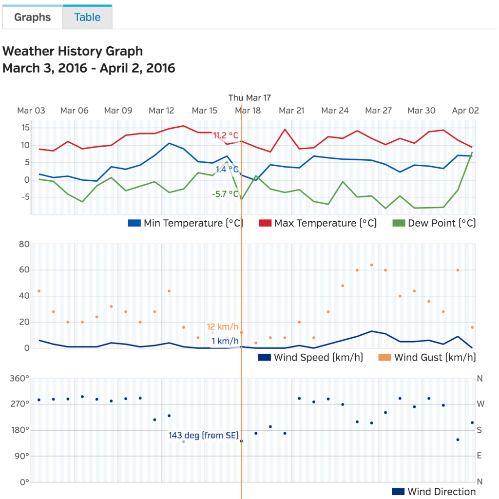
![graphs from wunderground data website]()
Wunderground have an excellent site with interactive graphs to look at weather data on a daily, monthly, and yearly level. Data is also available to download in CSV format, which is great for data science purposes.
import requests
import pandas as pd
from dateutil import parser, rrule
from datetime import datetime, time, date
import time

def getRainfallData(station, day, month, year):
    """
    Function to return a data frame of minute-level weather data for a single Wunderground PWS station.

    Args:
        station (string): Station code from the Wunderground website
        day (int): Day of month for which data is requested
        month (int): Month for which data is requested
        year (int): Year for which data is requested

    Returns:
        Pandas Dataframe with weather data for specified station and date.
    """
    url = "http://www.wunderground.com/weatherstation/WXDailyHistory.asp?ID={station}&day={day}&month={month}&year={year}&graphspan=day&format=1"
    full_url = url.format(station=station, day=day, month=month, year=year)
    # Request data from wunderground data
    response = requests.get(full_url, headers={'User-agent': 'Mozilla/5.0 (Windows NT 6.1) AppleWebKit/537.36 (KHTML, like Gecko) Chrome/41.0.2228.0 Safari/537.36'})
    data = response.text
    # remove the excess <br> from the text data
    data = data.replace('<br>', '')
    # Convert to pandas dataframe (fails if issues with weather station)
    try:
        dataframe = pd.read_csv(io.StringIO(data), index_col=False)
        dataframe['station'] = station
    except Exception as e:
        print("Issue with date: {}-{}-{} for station {}".format(day,month,year, station))
        return None
    return dataframe

# Generate a list of all of the dates we want data for
start_date = "2015-01-01"
end_date = "2015-12-31"
start = parser.parse(start_date)
end = parser.parse(end_date)
dates = list(rrule.rrule(rrule.DAILY, dtstart=start, until=end))

# Create a list of stations here to download data for
stations = ["IDUBLINF3", "IDUBLINF2", "ICARRAIG2", "IGALWAYR2", "IBELFAST4", "ILONDON59", "IILEDEFR28"]
# Set a backoff time in seconds if a request fails
backoff_time = 10
data = {}

# Gather data for each station in turn and save to CSV.
for station in stations:
    print("Working on {}".format(station))
    data[station] = []
    for date in dates:
        # Print period status update messages
        if date.day % 10 == 0:
            print("Working on date: {} for station {}".format(date, station))
        done = False
        while done == False:
            try:
                weather_data = getRainfallData(station, date.day, date.month, date.year)
                done = True
            except ConnectionError as e:
                # May get rate limited by Wunderground.com, backoff if so.
                print("Got connection error on {}".format(date))
                print("Will retry in {} seconds".format(backoff_time))
                time.sleep(10)
        # Add each processed date to the overall data
        data[station].append(weather_data)
    # Finally combine all of the individual days and output to CSV for analysis.
    pd.concat(data[station]).to_csv("data/{}_weather.csv".format(station))
Cleansing and Data Processing
The data downloaded from Wunderground needs a little bit of work. Again, if you want the raw data, it’s here. Ultimately, we want to work out when its raining at certain times of the day and aggregate this result to daily, monthly, and yearly levels. As such, we use Pandas to add month, year, and date columns. Simple stuff in preparation, and we can then output plots as required.
station = 'IEDINBUR6' # Edinburgh
data_input = pd.read_csv('data/{}_weather.csv'.format(station))
# Give the variables some friendlier names and convert types as necessary.
data_raw['temp'] = data_raw['TemperatureC'].astype(float)
data_raw['rain'] = data_raw['HourlyPrecipMM'].astype(float)
data_raw['total_rain'] = data_raw['dailyrainMM'].astype(float)
data_raw['date'] = data_raw['DateUTC'].apply(parser.parse)
data_raw['humidity'] = data_raw['Humidity'].astype(float)
data_raw['wind_direction'] = data_raw['WindDirectionDegrees']
data_raw['wind'] = data_raw['WindSpeedKMH']
# Extract out only the data we need.
data = data_raw.loc[:, ['date', 'station', 'temp', 'rain', 'total_rain', 'humidity', 'wind']]
data = data[(data['date'] >= datetime(2015,1,1)) & (data['date'] <= datetime(2015,12,31))]
# There's an issue with some stations that record rainfall ~-2500 where data is missing.
if (data['rain'] < -500).sum() > 10:
print("There's more than 10 messed up days for {}".format(station))
# remove the bad samples
data = data[data['rain'] > -500]
# Assign the "day" to every date entry
data['day'] = data['date'].apply(lambda x: x.date())
# Get the time, day, and hour of each timestamp in the dataset
data['time_of_day'] = data['date'].apply(lambda x: x.time())
data['day_of_week'] = data['date'].apply(lambda x: x.weekday())
data['hour_of_day'] = data['time_of_day'].apply(lambda x: x.hour)
# Mark the month for each entry so we can look at monthly patterns
data['month'] = data['date'].apply(lambda x: x.month)
# Is each time stamp on a working day (Mon-Fri)
data['working_day'] = (data['day_of_week'] >= 0) & (data['day_of_week'] <= 4)
# Classify into morning or evening times (assuming travel between 8.15-9am and 5.15-6pm)
data['morning'] = (data['time_of_day'] >= time(8,15)) & (data['time_of_day'] <= time(9,0))
data['evening'] = (data['time_of_day'] >= time(17,15)) & (data['time_of_day'] <= time(18,0))
# If there's any rain at all, mark that!
data['raining'] = data['rain'] > 0.0
# You get wet cycling if its a working day, and its raining at the travel times!
data['get_wet_cycling'] = (data['working_day']) & ((data['morning'] & data['rain']) |
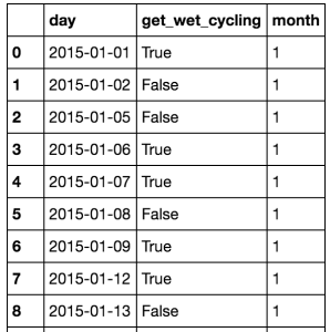
(data['evening'] & data['rain']))At this point, the dataset is relatively clean, and ready for analysis. If you are not familiar with grouping and aggregation procedures in Python and Pandas, here is another blog post on the topic.
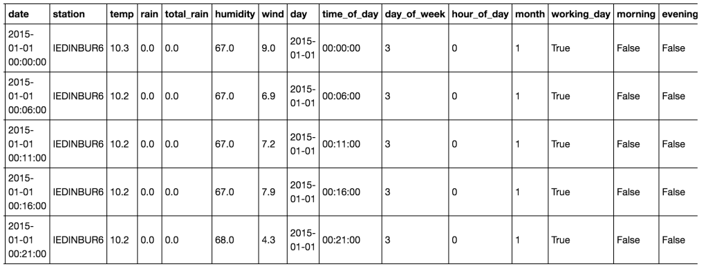
![Data after cleansing from Wunderground.com. This data is now in good format for grouping and visualisation using Pandas.]()
Data after cleansing from Wunderground.com. This data is now in good format for grouping and visualisation using Pandas.
Data summarisation and aggregation
With the data cleansed, we now have non-uniform samples of the weather at a given station throughout the year, at a sub-hour level. To make meaningful plots on this data, we can aggregate over the days and months to gain an overall view and to compare across stations.
# Looking at the working days only and create a daily data set of working days:
wet_cycling = data[data['working_day'] == True].groupby('day')['get_wet_cycling'].any()
wet_cycling = pd.DataFrame(wet_cycling).reset_index()
# Group by month for display - monthly data set for plots.
wet_cycling['month'] = wet_cycling['day'].apply(lambda x: x.month)
monthly = wet_cycling.groupby('month')['get_wet_cycling'].value_counts().reset_index()
monthly.rename(columns={"get_wet_cycling":"Rainy", 0:"Days"}, inplace=True)
monthly.replace({"Rainy": {True: "Wet", False:"Dry"}}, inplace=True)
monthly['month_name'] = monthly['month'].apply(lambda x: calendar.month_abbr[x])
# Get aggregate stats for each day in the dataset on rain in general - for heatmaps.
rainy_days = data.groupby(['day']).agg({
"rain": {"rain": lambda x: (x > 0.0).any(),
"rain_amount": "sum"},
"total_rain": {"total_rain": "max"},
"get_wet_cycling": {"get_wet_cycling": "any"}
})
# clean up the aggregated data to a more easily analysed set:
rainy_days.reset_index(drop=False, inplace=True) # remove the 'day' as the index
rainy_days.rename(columns={"":"date"}, inplace=True) # The old index column didn't have a name - add "date" as name
rainy_days.columns = rainy_days.columns.droplevel(level=0) # The aggregation left us with a multi-index
# Remove the top level of this index.
rainy_days['rain'] = rainy_days['rain'].astype(bool) # Change the "rain" column to True/False values
# Add the number of rainy hours per day this to the rainy_days dataset.
temp = data.groupby(["day", "hour_of_day"])['raining'].any()
temp = temp.groupby(level=[0]).sum().reset_index()
temp.rename(columns={'raining': 'hours_raining'}, inplace=True)
temp['day'] = temp['day'].apply(lambda x: x.to_datetime().date())
rainy_days = rainy_days.merge(temp, left_on='date', right_on='day', how='left')
rainy_days.drop('day', axis=1, inplace=True)
print "In the year, there were {} rainy days of {} at {}".format(rainy_days['rain'].sum(), len(rainy_days), station)
print "It was wet while cycling {} working days of {} at {}".format(wet_cycling['get_wet_cycling'].sum(),
len(wet_cycling),
station)
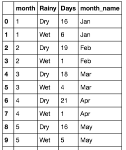
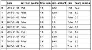
print "You get wet cycling {} % of the time!!".format(wet_cycling['get_wet_cycling'].sum()*1.0*100/len(wet_cycling))At this point, we have two basic data frames which we can use to visualise patterns for the city being analysed.
!["Monthly" data frame gives the number of wet and dry commutes per month of the year]()
!["Rainy_days" examines how much rain there was daily in the dataset with how often commuters got wet.]()
!["wet_cycling" is a subset of "rainy_days".]()
Visualisation using Pandas and Seaborn
At this point, we can start to plot the data. It’s well worth reading the documentation on plotting with Pandas, and looking over the API of Seaborn, a high-level data visualisation library that is a level above matplotlib.
This is not a tutorial on how to plot with seaborn or pandas – that’ll be a seperate blog post, but rather instructions on how to reproduce the plots shown on this blog post.
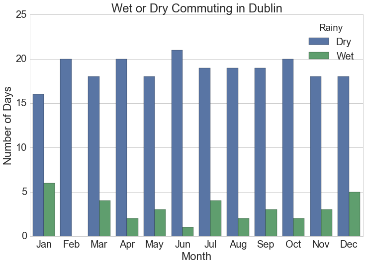
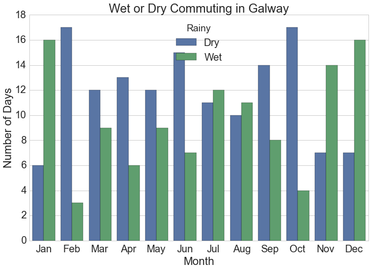
Barchart of Monthly Rainy Cycles
The monthly summarised rainfall data is the source for this chart.
# Monthly plot of rainy days
plt.figure(figsize=(12,8))
sns.set_style("whitegrid")
sns.set_context("notebook", font_scale=2)
sns.barplot(x="month_name", y="Days", hue="Rainy", data=monthly.sort_values(['month', 'Rainy']))
plt.xlabel("Month")
plt.ylabel("Number of Days")
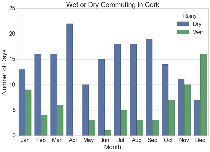
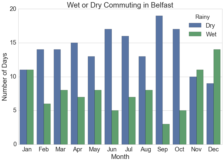
plt.title("Wet or Dry Commuting in {}".format(station))![Number of days monthly when cyclists get wet commuting at typical work times in Dublin, Ireland.]()
Number of days monthly when cyclists get wet commuting at typical work times in Dublin, Ireland.
Heatmaps of Rainfall and Rainy Hours per day
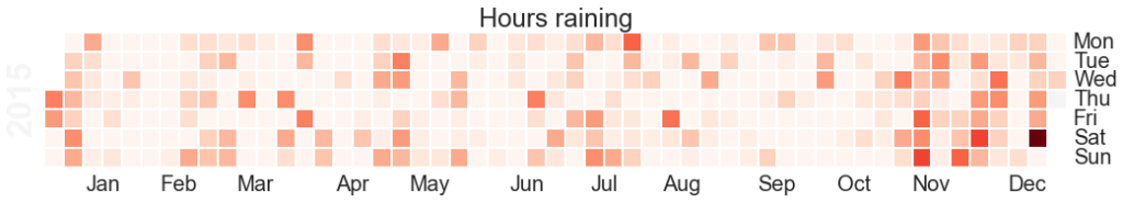
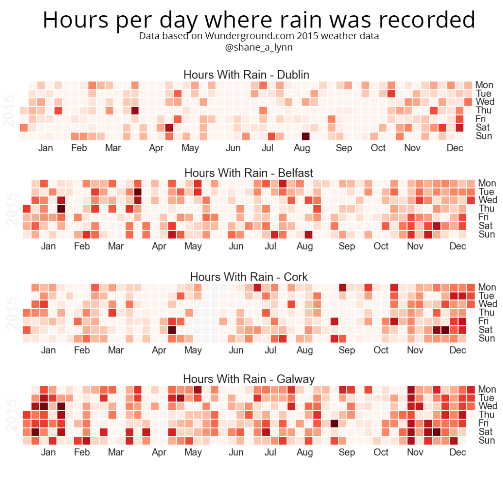
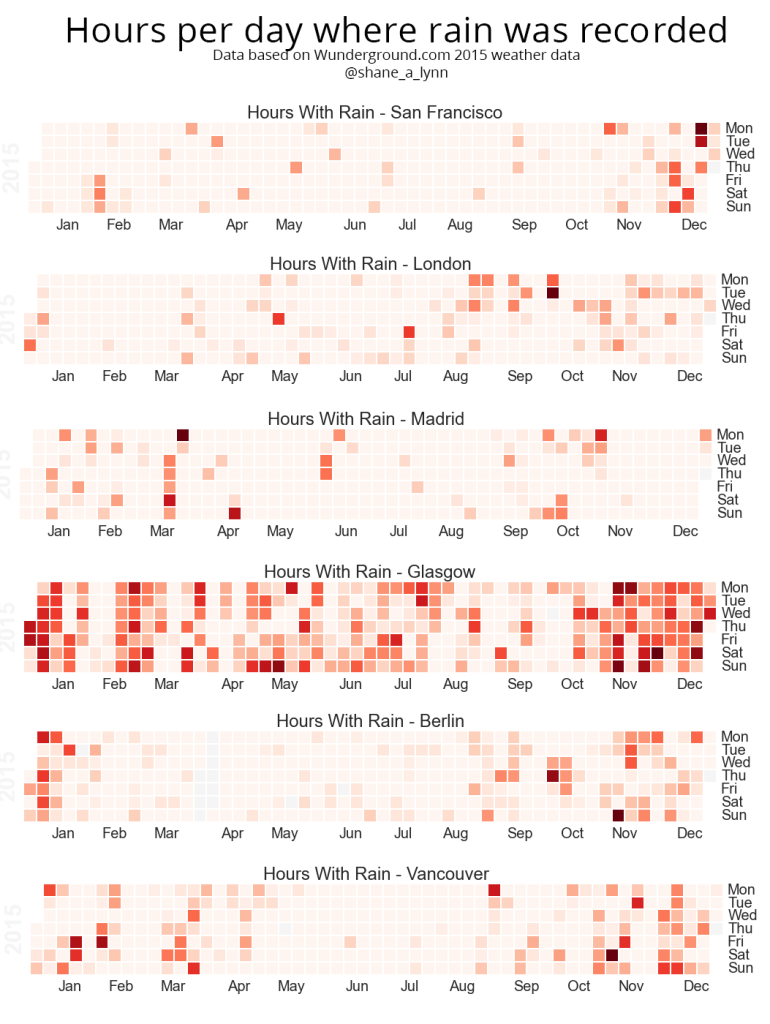
The heatmaps shown on the blog post are generated using the “calmap” python library, installable using pip. Simply import the library, and form a Pandas series with a DateTimeIndex and the library takes care of the rest. I had some difficulty here with font sizes, so had to increase the size of the plot overall to counter.
import calmap
temp = rainy_days.copy().set_index(pd.DatetimeIndex(analysis['rainy_days']['date']))
#temp.set_index('date', inplace=True)
fig, ax = calmap.calendarplot(temp['hours_raining'], fig_kws={"figsize":(15,4)})
plt.title("Hours raining")
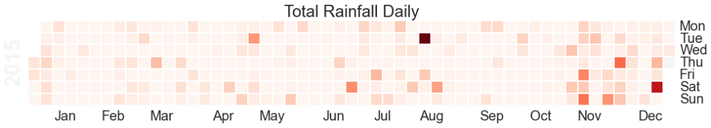
fig, ax = calmap.calendarplot(temp['total_rain'], fig_kws={"figsize":(15,4)})
plt.title("Total Rainfall Daily")![Hours raining per day heatmap]()
The Calmap package is very useful for generating heatmaps. Note that if you have highly outlying points of data, these will skew your color mapping considerably – I’d advise removing or reducing them for visualisation purposes.
![Total Daily Rainfall Heatmap]()
Heatmap of total rainfall daily over 2015. Note that if you are looking at rainfall data like this, outlying values such as that in August in this example will skew the overall visualisation and reduce the colour-resolution of smaller values. Its best to normalise the data or reduce the outliers prior to plotting.
Exploratory Line Plots
Remember that Pandas can be used on its own for quick visualisations of the data – this is really useful for error checking and sense checking your results. For example:
temp[['get_wet_cycling', 'total_rain', 'hours_raining']].plot()
![Quickly view and analyse your data with Pandas straight out of the box. The .plot() command will plot against the axis, but you can specify x and y variables as required.]()
Quickly view and analyse your data with Pandas straight out of the box. The .plot() command will plot against the axis, but you can specify x and y variables as required.
Comparison of Every City in Dataset
To compare every city in the dataset, summary stats for each city were calculated in advance and then the plot was generated using the seaborn library. To achieve this as quickly as possible, I wrapped the entire data preparation and cleansing phase described above into a single function called “analyse data”, used this function on each city’s dataset, and extracted out the pieces of information needed for the plot.
Here’s the wrapped analyse_data function:
def analyse_station(data_raw, station):
    """
    Function to analyse weather data for a period from one weather station.

    Args:
        data_raw (pd.DataFrame): Pandas Dataframe made from CSV downloaded from wunderground.com
        station (String): Name of station being analysed (for comments)

    Returns:
        dict: Dictionary with analysis in keys:
            data: Processed and cleansed data
            monthly: Monthly aggregated statistics on rainfall etc.
            wet_cycling: Data on working days and whether you get wet or not commuting
            rainy_days: Daily total rainfall for each day in dataset.
    """
    # Give the variables some friendlier names and convert types as necessary.
    data_raw['temp'] = data_raw['TemperatureC'].astype(float)
    data_raw['rain'] = data_raw['HourlyPrecipMM'].astype(float)
    data_raw['total_rain'] = data_raw['dailyrainMM'].astype(float)
    data_raw['date'] = data_raw['DateUTC'].apply(parser.parse)
    data_raw['humidity'] = data_raw['Humidity'].astype(float)
    data_raw['wind_direction'] = data_raw['WindDirectionDegrees']
    data_raw['wind'] = data_raw['WindSpeedKMH']

    # Extract out only the data we need.
    data = data_raw.loc[:, ['date', 'station', 'temp', 'rain', 'total_rain', 'humidity', 'wind']]
    data = data[(data['date'] >= datetime(2015,1,1)) & (data['date'] <= datetime(2015,12,31))]

    # There's an issue with some stations that record rainfall ~-2500 where data is missing.
    if (data['rain'] < -500).sum() > 10:
        print("There's more than 10 messed up days for {}".format(station))

    # remove the bad samples
    data = data[data['rain'] > -500]

    # Assign the "day" to every date entry
    data['day'] = data['date'].apply(lambda x: x.date())

    # Get the time, day, and hour of each timestamp in the dataset
    data['time_of_day'] = data['date'].apply(lambda x: x.time())
    data['day_of_week'] = data['date'].apply(lambda x: x.weekday())
    data['hour_of_day'] = data['time_of_day'].apply(lambda x: x.hour)
    # Mark the month for each entry so we can look at monthly patterns
    data['month'] = data['date'].apply(lambda x: x.month)

    # Is each time stamp on a working day (Mon-Fri)
    data['working_day'] = (data['day_of_week'] >= 0) & (data['day_of_week'] <= 4)

    # Classify into morning or evening times (assuming travel between 8.15-9am and 5.15-6pm)
    data['morning'] = (data['time_of_day'] >= time(8,15)) & (data['time_of_day'] <= time(9,0))
    data['evening'] = (data['time_of_day'] >= time(17,15)) & (data['time_of_day'] <= time(18,0))

    # If there's any rain at all, mark that!
    data['raining'] = data['rain'] > 0.0

    # You get wet cycling if its a working day, and its raining at the travel times!
    data['get_wet_cycling'] = (data['working_day']) & ((data['morning'] & data['rain']) |
                                                       (data['evening'] & data['rain']))
    # Looking at the working days only:
    wet_cycling = data[data['working_day'] == True].groupby('day')['get_wet_cycling'].any()
    wet_cycling = pd.DataFrame(wet_cycling).reset_index()

    # Group by month for display
    wet_cycling['month'] = wet_cycling['day'].apply(lambda x: x.month)
    monthly = wet_cycling.groupby('month')['get_wet_cycling'].value_counts().reset_index()
    monthly.rename(columns={"get_wet_cycling":"Rainy", 0:"Days"}, inplace=True)
    monthly.replace({"Rainy": {True: "Wet", False:"Dry"}}, inplace=True)
    monthly['month_name'] = monthly['month'].apply(lambda x: calendar.month_abbr[x])

    # Get aggregate stats for each day in the dataset.
    rainy_days = data.groupby(['day']).agg({
            "rain": {"rain": lambda x: (x > 0.0).any(),
                     "rain_amount": "sum"},
            "total_rain": {"total_rain": "max"},
            "get_wet_cycling": {"get_wet_cycling": "any"}
            })
    rainy_days.reset_index(drop=False, inplace=True)
    rainy_days.columns = rainy_days.columns.droplevel(level=0)
    rainy_days['rain'] = rainy_days['rain'].astype(bool)
    rainy_days.rename(columns={"":"date"}, inplace=True)

    # Also get the number of hours per day where its raining, and add this to the rainy_days dataset.
    temp = data.groupby(["day", "hour_of_day"])['raining'].any()
    temp = temp.groupby(level=[0]).sum().reset_index()
    temp.rename(columns={'raining': 'hours_raining'}, inplace=True)
    temp['day'] = temp['day'].apply(lambda x: x.to_datetime().date())
    rainy_days = rainy_days.merge(temp, left_on='date', right_on='day', how='left')
    rainy_days.drop('day', axis=1, inplace=True)

    print "In the year, there were {} rainy days of {} at {}".format(rainy_days['rain'].sum(), len(rainy_days), station)
    print "It was wet while cycling {} working days of {} at {}".format(wet_cycling['get_wet_cycling'].sum(),
                                                          len(wet_cycling),
                                                         station)
    print "You get wet cycling {} % of the time!!".format(wet_cycling['get_wet_cycling'].sum()*1.0*100/len(wet_cycling))

    return {"data":data, 'monthly':monthly, "wet_cycling":wet_cycling, 'rainy_days': rainy_days}
The following code was used to individually analyse the raw data for each city in turn. Note that this could be done in a more memory efficient manner by simply saving the aggregate statistics for each city at first rather than loading all into memory. I would recommend that approach if you are dealing with more cities etc.
# Load up each of the stations into memory.
stations = [
 ("IAMSTERD55", "Amsterdam"),
 ("IBCNORTH17", "Vancouver"),
 ("IBELFAST4", "Belfast"),
 ("IBERLINB54", "Berlin"),
 ("ICOGALWA4", "Galway"),
 ("ICOMUNID56", "Madrid"),
 ("IDUBLIND35", "Dublin"),
 ("ILAZIORO71", "Rome"),
 ("ILEDEFRA6", "Paris"),
 ("ILONDONL28", "London"),
 ("IMUNSTER11", "Cork"),
 ("INEWSOUT455", "Sydney"),
 ("ISOPAULO61", "Sao Paulo"),
 ("IWESTERN99", "Cape Town"),
 ("KCASANFR148", "San Francisco"),
 ("KNYBROOK40", "New York"),
 ("IRENFREW4", "Glasgow"),
 ("IENGLAND64", "Liverpool"),
 ('IEDINBUR6', 'Edinburgh')
]
data = []
for station in stations:
   weather = {}
   print "Loading data for station: {}".format(station[1])
   weather['data'] = pd.DataFrame.from_csv("data/{}_weather.csv".format(station[0]))
   weather['station'] = station[0]
   weather['name'] = station[1]
   data.append(weather)

for ii in range(len(data)):
    print "Processing data for {}".format(data[ii]['name'])
    data[ii]['result'] = analyse_station(data[ii]['data'], data[ii]['station'])

# Now extract the number of wet days, the number of wet cycling days, and the number of wet commutes for a single chart.
output = []
for ii in range(len(data)):
    temp = {
            "total_wet_days": data[ii]['result']['rainy_days']['rain'].sum(),
            "wet_commutes": data[ii]['result']['wet_cycling']['get_wet_cycling'].sum(),
            "commutes": len(data[ii]['result']['wet_cycling']),
            "city": data[ii]['name']
        }
    temp['percent_wet_commute'] = (temp['wet_commutes'] *1.0 / temp['commutes'])*100
    output.append(temp)
output = pd.DataFrame(output)
The final step in the process is to actually create the diagram using Seaborn.
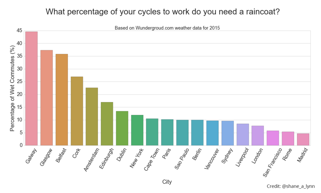
# Generate plot of percentage of wet commutes
plt.figure(figsize=(20,8))
sns.set_style("whitegrid")    # Set style for seaborn output
sns.set_context("notebook", font_scale=2)
sns.barplot(x="city", y="percent_wet_commute", data=output.sort_values('percent_wet_commute', ascending=False))
plt.xlabel("City")
plt.ylabel("Percentage of Wet Commutes (%)")
plt.suptitle("What percentage of your cycles to work do you need a raincoat?", y=1.05, fontsize=32)
plt.title("Based on Wundergroud.com weather data for 2015", fontsize=18)
plt.xticks(rotation=60)
plt.savefig("images/city_comparison_wet_commutes.png", bbox_inches='tight')![Percentage of times you got wet cycling to work in 2015 for cities globally. Galway comes out consistently as one of the wettest places for a cycling commute in the data available, but 2015 was a particularly bad year for Irish weather. Here's hoping for 2016.]()
Percentage of times you got wet cycling to work in 2015 for cities globally. Galway comes out consistently as one of the wettest places for a cycling commute in the data available, but 2015 was a particularly bad year for Irish weather. Here’s hoping for 2016.
If you do proceed to using this code in any of your work, please do let me know!


 In order to demonstrate the effectiveness and simplicity of the grouping commands, we will need some data. For an example dataset, I have extracted my own mobile phone usage records. I analyse this type of data using Pandas during my work on


![Pandas Dataframe with index set using .set_index() for .loc[] explanation.](http://104.236.88.249/wp-content/uploads/2016/09/index_set_dataframe-1024x497.png)


