Geocode your addresses for free with Python and Google
For a recent project, I ported the “batch geocoding in R” script over to Python. The script allows geocoding of large numbers of string addresses to latitude and longitude values using the Google Maps Geocoding API. The Google Geocoding API is one of the most accurate geocoding APIs out there at the moment.
The script encodes addresses up to the daily geocoding limit each day, and then waits until Google refills your allowance before continuing. You can leave the script running on a remote server (I use Digital Ocean, where you can get a free $10 server with my referral link), and over the course of a week, encode nearly 20,000 addresses.
There are a few options with respect to Google and your API depending if you want results fast and are willing to pay, or if you are in no rush, and want to geocode for free:
With no API key, the script will work at a slow rate of approx 1 request per second if you have no API key, up to the free limit of 2,500 geocoded addresses per day.
Get a free API key to up the rate to 50 requests per second, but still limited to 2,500 per day. API keys are easily generated at the Google Developers API Console. You’ll need to get a “Google Maps Geocoding API”, find this, press enable, and then look under “credentials”.
Associate a payment method or billing account with Google and your API key, and have limitless fast geocoding results at a rate of $0.50 per 1000 additional addresses beyond the free 2,500 per day.
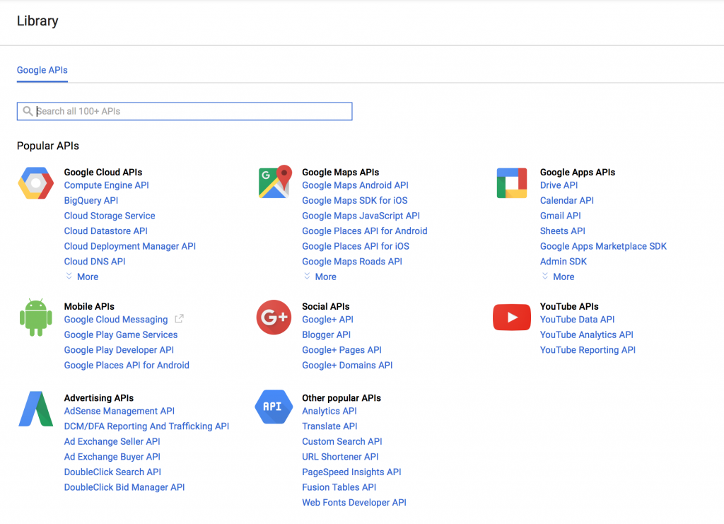
There’s a tonne of APIs available on the Google Developers website. For this script, you’ll want a maps geocoding API for the Python script
Python Geocoding Script
The script uses Python 3, and can be downloaded with and some demonstration data on Github at “python batch geocoding” project. There’s a requirements.txt file that will allow you to construct a virtualenv around the script, and you can run it indefinitely over ssh on a remote server using the “screen” command (“Screen” allows you to run terminal commands while logged out of an ssh session – really useful if you use cloud servers).
Input Data
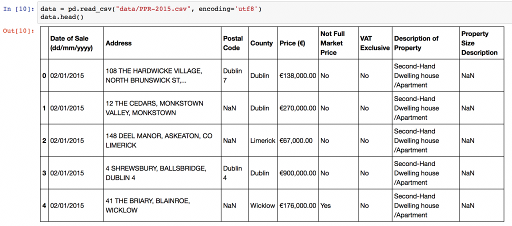
The script expects an input CSV file with a column that contains addresses. The default column name is “Address”, but you can specify different names in the configuration section of the script. You can create CSV files from Excel using using “Save As”->CSV. The sample data in the repository is the 2015 Property Price Register data for Ireland. Some additional preprocessing on addresses is performed to improve accuracy, adding County and Country level information. Remove or change these lines in the script as necessary!
Sample geocoding data downloaded from the Irish property price register. The “Address” column is used as input from your input CSV file.
Output Data
The script will take each address and geocode it using the Google APIs, returning:
the matching latitude and longitude,
the cleaned and formatted address from Google,
postcode of the matched address / (eircode in Ireland)
accuracy of the match,
the “type” of the location – “street, neighbourhood, locality”
google place ID,
the number of results returned,
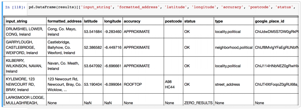
the entire JSON response (see example below) from Google can be requested if there’s additional information that you’d like to parse yourself. Change this in the configuration section of the script.
Format for output data from geocoding script. Elements of the google response are parsed and extracted in CSV format by the geocoding script.
The full JSON response from the Google API contains additional positional information for addresses. In some cases, there can be multiple matches for places, which will be included here. By setting “RETURN_FULL_RESULTS=True” in the python script, you can retrieve this information for each address.
Script Setup
To setup the script, optionally insert your API key, your input file name, input column name, and your output file name, then simply run the code with “python3 python_batch_geocode.py” and come back in (<total addresses>/2500) days! Each time the script hits the geocoding limit, it backs off for 30 minutes before trying again with Google.
Python Code Function
The script functionality is simple: there’s a central function “get_google_result()” that actually requests data from the Google API using the Python requests library, and then a wrapper around that starting at line 133 to handle data backup and geocoding query limits.
There’s a number of tips and tricks to improve the accuracy of your geocoding efforts.
Append additional contextual information if you have it. For instance, in the example here, I appended “, Ireland” to the address since I knew all of my addresses were Irish locations. I could have also done some work with the “County” field in my input data.
Simple text processing before upload can improve accuracy. Replacing st. with Street, removing unusual characters, replacing brdg with bridge, sq with Square, etc., all leaves Google with less to guess and can help.
Try and ensure your addresses are as well formed as possible, with commas in the right places separating “lines” of the address.
You can parse and repair your address strings with specialised address parsing libraries in python – have a look at postal-address, us-address (for US addresses), and pyaddress which might help out.
In any real world data science situation with Python, you’ll be about 10 minutes in when you’ll need to merge or join Pandas Dataframes together to form your analysis dataset. Merging and joining dataframes is a core process that any aspiring data analyst will need to master. This blog post addresses the process of merging datasets, that is, joining two datasets together based on common columns between them. Key topics covered here:
If you’d like to work through the tutorial yourself, I’m using a Jupyter notebook setup with Python 3.5.2 from Anaconda, and I’ve posted the code on GitHub here. I’ve included the sample datasets in the GitHub repository.
Merging overview if you need a quickstart (all explanations below)! The Pandas merge() command takes the left and right dataframes, matches rows based on the “on” columns, and performs different types of merges – left, right, etc.
Example data
For this post, I have taken some real data from the KillBiller application and some downloaded data, contained in three CSV files:
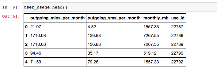
user_usage.csv – A first dataset containing users monthly mobile usage statistics
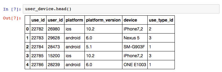
user_device.csv – A second dataset containing details of an individual “use” of the system, with dates and device information.
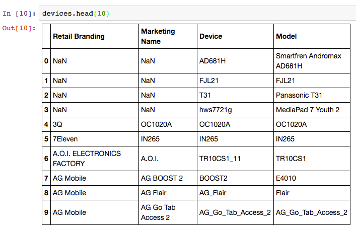
android_devices.csv – A third dataset with device and manufacturer data, which lists all Android devices and their model code, obtained from Google here.
Sample usage information from the KillBiller application showing monthly mobile usage statistics for a subset of users.
User information from KillBiller application giving the device and OS version for individual “uses” of the KillBiller application.
Android Device data, containing all Android devices with manufacturer and model details.
There are linking attributes between the sample datasets that are important to note – “use_id” is shared between the user_usage and user_device, and the “device” column of user_device and “Model” column of the devices dataset contain common codes.
Sample problem
We would like to determine if the usage patterns for users differ between different devices. For example, do users using Samsung devices use more call minutes than those using LG devices? This is a toy problem given the small sample size in these dataset, but is a perfect example of where merges are required.
We want to form a single dataframe with columns for user usage figures (calls per month, sms per month etc) and also columns with device information (model, manufacturer, etc). We will need to “merge” (or “join”) our sample datasets together into one single dataset for analysis.
Merging DataFrames
“Merging” two datasets is the process of bringing two datasets together into one, and aligning the rows from each based on common attributes or columns.
The words “merge” and “join” are used relatively interchangeably in Pandas and other languages, namely SQL and R. In Pandas, there are separate “merge” and “join” functions, both of which do similar things.
In this example scenario, we will need to perform two steps:
For each row in the user_usage dataset – make a new column that contains the “device” code from the user_devices dataframe. i.e. for the first row, the use_id is 22787, so we go to the user_devices dataset, find the use_id 22787, and copy the value from the “device” column across.
After this is complete, we take the new device columns, and we find the corresponding “Retail Branding” and “Model” from the devices dataset.
Finally, we can look at different statistics for usage splitting and grouping data by the device manufacturers used.
Can I use a for loop?
Yes. You could write for loops for this task. The first would loop through the use_id in the user_usage dataset, and then find the right element in user_devices. The second for loop will repeat this process for the devices.
However, using for loops will be much slower and more verbose than using Pandas merge functionality. So, if you come across this situation – don’t use for loops.
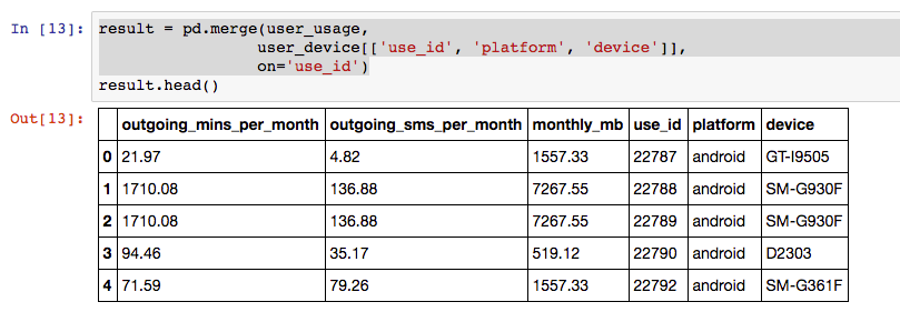
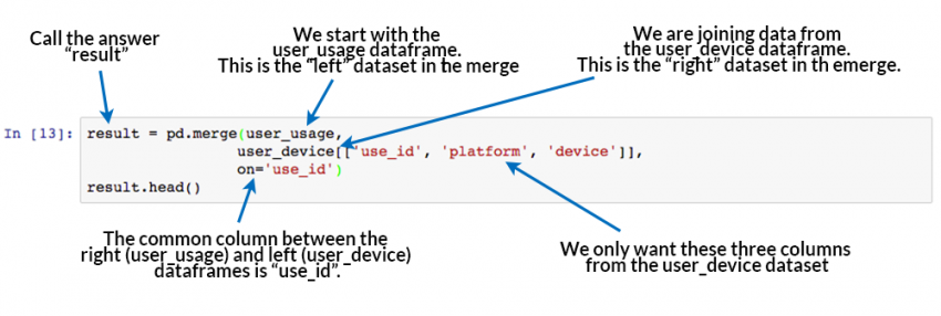
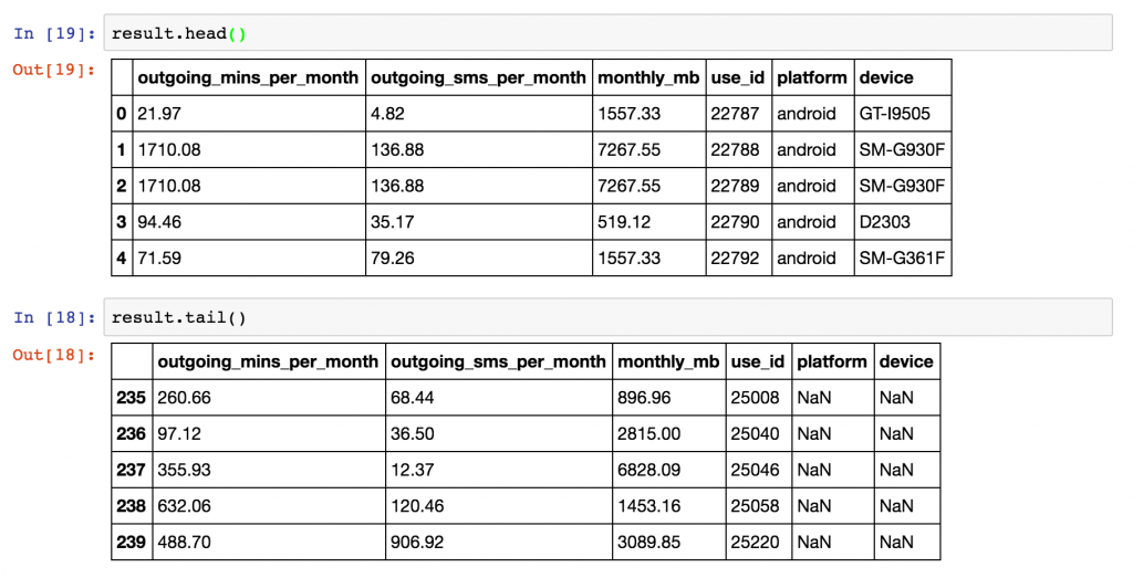
Merging user_usage with user_devices
Lets see how we can correctly add the “device” and “platform” columns to the user_usage dataframe using the Pandas Merge command.
result = pd.merge(user_usage,
                 user_device[['use_id', 'platform', 'device']],
                 on='use_id')
result.head()
Result of merging user usage with user devices based on a common column.
So that works, and very easily! Now – how did that work? What was the pd.merge command doing?
How Pandas Merge commands work. At the very least, merging requires a “left” dataset, a “right” dataset, and a common column to merge “on”.
The merge command is the key learning objective of this post. The merging operation at its simplest takes a left dataframe (the first argument), a right dataframe (the second argument), and then a merge column name, or a column to merge “on”. In the output/result, rows from the left and right dataframes are matched up where there are common values of the merge column specified by “on”.
With this result, we can now move on to get the manufacturer and model number from the “devices” dataset. However, first we need to understand a little more about merge types and the sizes of the output dataframe.
Inner, Left, and right merge types
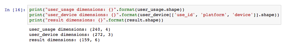
In our example above, we merged user_usage with user_devices. The head() preview of the result looks great, but there’s more to this than meets the eye. First, let’s look at the sizes or shapes of our inputs and outputs to the merge command:
The resultant size of the dataset after the merge operation may not be as expected. Pandas merge() defaults to an “inner” merge operation.
Why is the result a different size to both the original dataframes?
By default, the Pandas merge operation acts with an “inner” merge. An inner merge, (or inner join) keeps only the common values in both the left and right dataframes for the result. In our example above, only the rows that contain use_id values that are common between user_usage and user_device remain in the result dataset. We can validate this by looking at how many values are common:
Only common values between the left and right dataframes are retained by default in Pandas, i.e. an “inner” merge is used.
There are 159 values of use_id in the user_usage table that appear in user_device. These are the same values that also appear in the final result dataframe (159 rows).
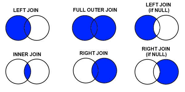
Other Merge Types
There are three different types of merges available in Pandas. These merge types are common across most database and data-orientated languages (SQL, R, SAS) and are typically referred to as “joins”. If you don’t know them, learn them now.
Inner Merge / Inner join – The default Pandas behaviour, only keep rows where the merge “on” value exists in both the left and right dataframes.
Left Merge / Left outer join – (aka left merge or left join) Keep every row in the left dataframe. Where there are missing values of the “on” variable in the right dataframe, add empty / NaN values in the result.
Right Merge / Right outer join – (aka right merge or right join) Keep every row in the right dataframe. Where there are missing values of the “on” variable in the left column, add empty / NaN values in the result.
Outer Merge / Full outer join – A full outer join returns all the rows from the left dataframe, all the rows from the right dataframe, and matches up rows where possible, with NaNs elsewhere.
The merge type to use is specified using the “how” parameter in the merge command, taking values “left”, “right”, “inner” (default), or “outer”.
Venn diagrams are commonly used to exemplify the different merge and join types. See this example from Stack overflow:
Merge/Join types as used in Pandas, R, SQL, and other data-orientated languages and libraries. Source: Stack Overflow.
If this is new to you, or you are looking at the above with a frown, take the time to watch this video on “merging dataframes” from Coursera for another explanation that might help. We’ll now look at each merge type in more detail, and work through examples of each.
Example of left merge / left join
Let’s repeat our merge operation, but this time perform a “left merge” in Pandas.
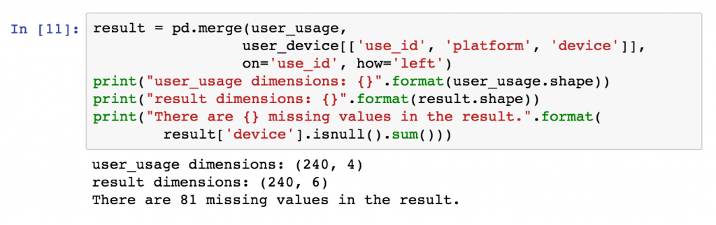
Originally, the result dataframe had 159 rows, because there were 159 values of “use_id” common between our left and right dataframes and an “inner” merge was used by default.
For our left merge, we expect the result to have the same number of rows as our left dataframe “user_usage” (240), with missing values for all but 159 of the merged “platform” and “device” columns (81 rows).
We expect the result to have the same number of rows as the left dataframe because each use_id in user_usage appears only once in user_device. A one-to-one mapping is not always the case. In merge operations where a single row in the left dataframe is matched by multiple rows in the right dataframe, multiple result rows will be generated. i.e. if a use_id value in user_usage appears twice in the user_device dataframe, there will be two rows for that use_id in the join result.
You can change the merge to a left-merge with the “how” parameter to your merge command. The top of the result dataframe contains the successfully matched items, and at the bottom contains the rows in user_usage that didn’t have a corresponding use_id in user_device.
result = pd.merge(user_usage,
                 user_device[['use_id', 'platform', 'device']],
                 on='use_id',
                 how='left')
Left join example in pandas. Specify the join type in the “how” command. A left join, or left merge, keeps every row from the left dataframe.
Result from left-join or left-merge of two dataframes in Pandas. Rows in the left dataframe that have no corresponding join value in the right dataframe are left with NaN values.
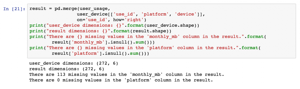
Example of right merge / right join
For examples sake, we can repeat this process with a right join / right merge, simply by replacing how=’left’ with how=’right’ in the Pandas merge command.
result = pd.merge(user_usage,
                 user_device[['use_id', 'platform', 'device']],
                 on='use_id',
                 how='right')
The result expected will have the same number of rows as the right dataframe, user_device, but have several empty, or NaN values in the columns originating in the left dataframe, user_usage (namely “outgoing_mins_per_month”, “outgoing_sms_per_month”, and “monthly_mb”). Conversely, we expect no missing values in the columns originating in the right dataframe, “user_device”.
Example of a right merge, or right join. Note that the output has the same number of rows as the right dataframe, with missing values only where use_id in the left dataframe didn’t match anything in the left.
Example of outer merge / full outer join
Finally, we will perform an outer merge using Pandas, also referred to as a “full outer join” or just “outer join”. An outer join can be seen as a combination of left and right joins, or the opposite of an inner join. In outer joins, every row from the left and right dataframes is retained in the result, with NaNs where there are no matched join variables.
As such, we would expect the results to have the same number of rows as there are distinct values of “use_id” between user_device and user_usage, i.e. every join value from the left dataframe will be in the result along with every value from the right dataframe, and they’ll be linked where possible.
Outer merge result using Pandas. Every row from the left and right dataframes is retained in the result, with missing values or numpy NaN values where the merge column doesn’t match.
In the diagram below, example rows from the outer merge result are shown, the first two are examples where the “use_id” was common between the dataframes, the second two originated only from the left dataframe, and the final two originated only from the right dataframe.
Using merge indicator to track merges
To assist with the identification of where rows originate from, Pandas provides an “indicator” parameter that can be used with the merge function which creates an additional column called “_merge” in the output that labels the original source for each row.
result = pd.merge(user_usage,
                 user_device[['use_id', 'platform', 'device']],
                 on='use_id',
                 how='outer',
                 indicator=True)
Example rows from outer merge (full outer join) result. Note that all rows from left and right merge dataframes are included, but NaNs will be in different columns depending if the data originated in the left or right dataframe.
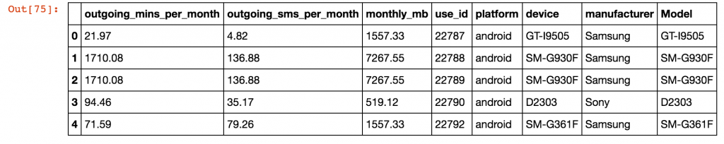
Final Merge – Joining device details to result
Coming back to our original problem, we have already merged user_usage with user_device, so we have the platform and device for each user. Originally, we used an “inner merge” as the default in Pandas, and as such, we only have entries for users where there is also device information. We’ll redo this merge using a left join to keep all users, and then use a second left merge to finally to get the device manufacturers in the same dataframe.
# First, add the platform and device to the user usage - use a left join this time.
result = pd.merge(user_usage,
                 user_device[['use_id', 'platform', 'device']],
                 on='use_id',
                 how='left')

# At this point, the platform and device columns are included
# in the result along with all columns from user_usage

# Now, based on the "device" column in result, match the "Model" column in devices.
devices.rename(columns={"Retail Branding": "manufacturer"}, inplace=True)
result = pd.merge(result,
                  devices[['manufacturer', 'Model']],
                  left_on='device',
                  right_on='Model',
                  how='left')
print(result.head())
Final merged result with device manufacturer information merged onto the user usage table. Two left merges were used to get to this point.
Using left_on and right_on to merge with different column names
The columns used in a merge operator do not need to be named the same in both the left and right dataframe. In the second merge above, note that the device ID is called “device” in the left dataframe, and called “Model” in the right dataframe.
Different column names are specified for merges in Pandas using the “left_on” and “right_on” parameters, instead of using only the “on” parameter.
Merging dataframes with different names for the joining variable is achieved using the left_on and right_on arguments to the pandas merge function.
Calculating statistics based on device
With our merges complete, we can use the data aggregation functionality of Pandas to quickly work out the mean usage for users based on device manufacturer. Note that the small sample size creates even smaller groups, so I wouldn’t attribute any statistical significance to these particular results!
Final result using agg() pandas aggregation to group by device manufacturer and work out mean statistics for different columns.
Becoming a master of merging – Part 2
That completes the first part of this merging tutorial. You should now have conquered the basics of merging, and be able to tackle your own merging and joining problems with the information above. Part 2 of this blog post addresses the following more advanced topics:
How do you merge dataframes using multiple join /common columns?
How do you merge dataframes based on the index of the dataframe?
What is the difference between the merge and join fucntions in Pandas?
How fast are merges in Python Pandas?
Other useful resources
Don’t let your merging mastery stop here. Try the following links for further explanations and information on the topic:
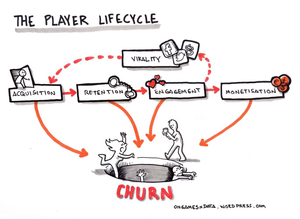
A lot of modern-day games, especially the ones being developed for mobile, are built on business models revolving around data. Understanding how the audience thinks and responds with a product, as well as knowing how retention works in gaming, are both important in paving the way for the future of gaming.
A data scientist can succeed in an environment where decisions are driven by data. Video games offer a convenient atmosphere for data collectors to experiment on.
There are over 2 billion gamers in the world right now, with Electronic Arts having approximately 150 million active mobile users that generate thousands of terabytes of data every day. In the U.S. alone, the gaming industry is bigger than the film industry. According to published stats, the U.S. Box Office rakes in about $8 billion per year with gaming pulling in more than double that figure at $20 billion. Clever application of big data techniques help drive customer engagement. These analyses help companies make more money from advertising and improve the gaming industry as a whole through informed decisions based on the data collected.
Product analytics after changes: What was the effect on monetisation and retention of this product feature or promotion?
User acquisition: Where do we spend our advertising budget amongst geo/platform/ad channel/game for maximum uptake?
Churn: Where are we losing customer? How do I predict churn? What do I do about it?
Product design: Some aspects of a game are very data driven and amenable to data science: for player vs player (pvp) games, data can be used to better players and make leaderboards.
Essentially everything in the player lifecycle is a target for data science. Small performance improvements, when scaled to millions of users, result in meaningful revenue generation for game developers.
The Gamer Lifecycle. How customers are gained and lost by game developers. Source: OnGamesNData
An example of a successful data-driven game is Candy Crush Saga, which is made almost $2 billion dollars in 2013 from in-game purchases. The game launched in 2012 but it’s still appearing in the top 10 grossing mobile games across the Google Play Store and the App Store.
Candy Crush Saga’s peak of success. Source: Business Insider
Traditional casino games have been extremely popular online for many years and have also moved to use data techniques to determine what games are showcased on their platforms. Due to the success of Game of Thrones on HBO, slots site Spin Genie were one of the first portals to tap into the popularity of the series by launching the Game of Thrones 15 Lines slot game. Game of Thrones is one of the most searched TV shows on Google, and The Guardian even published an article on the search numbers it received in 2016 for its individual characters, due to the sheer number. Using trending topics in pop culture is leading to business decision that help brands prevail for many years in the tough digital landscape while also making them financial sound choices.
Gaming developers constantly monitor their games and improve them based on consumer feedback. Candy Crush Saga continues to add features, while slot machine developers provide variety, fun features, and colorful animations to entice the public into playing. Companies increase their engagement with consumers if analytics reveal that players abandon a game if the first few levels are too difficult or easy. Data can be used to find bottlenecks within games, as well as areas that gamers enjoy the most based on the time they spend playing them. Analyzing millions of hours of player data gives insight into which elements of the game are popular among the masses, which can be used for future development. With the right tools monitoring player behaviour, companies can keep gamers engaged, happy, and determine which new titles to launch in the future.
Recently, I burned about 3 hours trying to load a large CSV file into Python Pandas using the read_csv function, only to consistently run into the following error:
ParserError                               Traceback (most recent call last)
<ipython-input-6-b51ad8562823> in <module>()
...
pandas\_libs\parsers.pyx in pandas._libs.parsers.TextReader.read (pandas\_libs\parsers.c:10862)()

pandas\_libs\parsers.pyx in pandas._libs.parsers.TextReader._read_low_memory (pandas\_libs\parsers.c:11138)()

pandas\_libs\parsers.pyx in pandas._libs.parsers.TextReader._read_rows (pandas\_libs\parsers.c:11884)()

pandas\_libs\parsers.pyx in pandas._libs.parsers.TextReader._tokenize_rows (pandas\_libs\parsers.c:11755)()

pandas\_libs\parsers.pyx in pandas._libs.parsers.raise_parser_error (pandas\_libs\parsers.c:28765)()

Error tokenizing data. C error: EOF inside string starting at line XXXX
“Error tokenising data. C error: EOF inside string starting at line”.
There was an erroneous character about 5000 lines into the CSV file that prevented the Pandas CSV parser from reading the entire file. Excel had no problems opening the file, and no amount of saving/re-saving/changing encodings was working. Manually removing the offending line worked, but ultimately, another character 6000 lines further into the file caused the same issue.
The solution was to use the parameter engine=’python’ in the read_csv function call. The Pandas CSV parser can use two different “engines” to parse CSV file – Python or C (default).
Parser engine to use. The C engine is faster while the python engine is currently more feature-complete.
The Python engine is described as “slower, but more feature complete” in the Pandas documentation. However, in this case, the python engine sorts the problem, without a massive time impact (overall file size was approx 200,000 rows).
UnicodeDecodeError
The other big problem with reading in CSV files that I come across is the error:
“UnicodeDecodeError: ‘utf-8’ codec can’t decode byte 0x96 in position XX: invalid start byte”
Character encoding issues can be usually fixed by opening the CSV file in Sublime Text, and then “Save with encoding” choosing UTF-8. Then adding the encoding=’utf8′ to the pandas.read_csv command allows Pandas to open the CSV file without trouble. This error appears regularly for me with files saved in Excel.
In this post, I’ve added GPS coordinates to the Property Price Register (PPR) data from years 2012-2017 (approx 220k property sales). Read below to find the method used to generate these results, or just download the files here:
Please let me know if the data is useful, and if you end up building anything great out of it! I’ll update the dataset when I can with the latest properties listed.
Data Example from geocoded property price register (PPR) data showing selected columns. There are 217k houses in the data set, and for each property, the sale date, address, latitude, longitude, small area ID, electoral district name, sale price, and other variables are available. The file can be downloaded above.
Note that there are some errors in the geocoding process documented below that are required reading for anyone performing analysis on this dataset.
Google Fusion Table visualisation of geocoded property prices. Circles are prices below €1 million in value. You can explore the data and map here.
Number of sales recorded per month in the property price register from 2012-2017
Median house sale price in Ireland per month from 2012 – 2017. Ireland is experiencing large rises in property prices over the last number of years.
This video was created with the remarkable Power Map plugin for Excel (of all the software!). This plugin is well worth a look if you want to make an impression in a quick and easy fashion, and you have data with location information well formatted.
The Property Price Register
An interesting data set for all Irish data scientists is the Irish Property Price Register. The property price register (PPR) records the price, address and date of sale on all residential properties which have been purchased in Ireland since 1 January 2010. The data searchable and freely downloadable to the public, forming, at this point, a repository of pricing information for 7 years worth of property sales.
List of properties as displayed on the Irish property price register.
The purpose of the register when launched was to “provide, on an ongoing basis, accurate prices of residential properties purchased at a particular date”, and while, not without its critisms on accuracy because the data is manually loaded, or the prices and addresses can be error prone.
One of the major limitations of the register is the information on each house sold, where houses are described only on a basic level with categories such as “second hand dwelling” and very rough size descriptions “greater than or equal to 38 sq metres and less than 125 sq metres”.
Sample entry on the property price register in Ireland. Detail on house types is limited to a price, date, address, and simple description.
Geocoding the PPR data
Google geocoding process
The PPR data is made much more useful with the addition of geocoded GPS coordinates, and furthermore with matching of these coordinates to CSO census small area and electoral district. With these matched, information on average house size, population demographics, family sizes and more can be approximated for each property sold.
The geocoding process was performed in Python, using the Google geocoding script detailed previously on this blog. The script was run on an Amazon instance with a free Google API key, and allowed to geocode 2,500 addresses a day, for a couple of weeks.
Geocode results
Over the entire dataset 2012 – 2017, there was a 93.4 % match rate, that is, 6.6 % of PPR addresses were returned from Google with no matching address found, and as such, no geocoded result. To improve this match rate, various methods of address correction or augmentation can be used before feeding the data into the geocoding script (if of interest).
Strangely, the rate of error is not constant from year to year, with a larger proportion of errors occurring in recent 2016 and 2017 sales.
Overall however, with some cleansing (see the problems below), an excellent data set for exploration of the spatial distribution of house pricing in Ireland becomes available.
Number of sales found per geocoded county result in the Property Price Register (PPR) data.
House and apartment prices in Ireland vary between city and countryside properties, with cities experiencing higher and faster rising prices.
Geocoding problems
The geocoding process is not perfect, and inaccuracies in encoding are intensified by Ireland’s baffling address formats and peculiarities, mainly outside of the main cities.
Note that the Google geocoded API returns different results to simply typing the address into the Google maps search.
Some of the issues found in this dataset include:
Some addresses in the PPR are not well formatted, and no results were returned at all by Google (approx 6% of cases).
Many addresses in Ireland are not unique, identified with just “<housename>, <town>”, and these result in only “approximate” location matches.
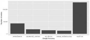
Accuracy of property price register (PPR) geocoding results as reported by Google. On examination, all rooftop results are not entirely precise but should provide a good match to Electoral District.
Many houses returned at the centre of cities / towns, rather than their exact location. An example of this is the address “10 Washington Street, South Circular Road, Dublin 8”, which is actually an invalid address, but gets geocoded to “Dublin, Ireland”. In this case, the results can be removed, along with the 2705 other addresses mapped to “Dublin, Ireland.” In some cases, approximate matches however will align at an electoral district level.
Badly formatted addresses and non-specific addresses are problems that plague anyone using location and address data in Ireland, which is screaming out for a functional postcode (Eircode tries its best, but is not without its issues and critics). In the geocoded data set, 95% of the input addresses are unique, but only 63% of the resulting output addresses.
Google thought that the location of approximately 400 houses were outside the borders of Ireland, returning addresses globally. The diagrams below show the extent of this issue:
Some of the addresses in the Property Price Register result in non-Irish GPS points when passed through the Google geocoder.
Errors in Irish addresses correspond to the very edge of small area boundaries – coastal or border locations. These are mainly accuracy issues and are relatively infrequent.
Over the entire dataset 2012 – 2017, there was a 93.4 % match rate, that is, 6.6 % of PPR addresses were returned from Google with no matching address found, and as such, no geocoded result. To improve this match rate, various methods of address correction or augmentation can be used before feeding the data into the geocoding script (if of interest).
Strangely, the rate of error is not constant from year to year, with a larger proportion of errors occurring in recent 2016 and 2017 sales.
Matching to small area and electoral district
Electoral Divisions (EDs) are legally defined administrative areas in Ireland for which Small Area Population Statistics (SAPS) are published from the Census. There are 3,440 defined EDs in the State. A smaller division, “Small Areas” are areas of population generally comprising between 80 and 120 dwellings and are designed as the lowest level of geography for the compilation of statistics in line with data protection. See the CSO website for more, and the picture below from the SAPMAP application for the ED divisions in Dublin City.
Ireland is divided into Electoral Divisions and Small areas. This diagram shows Electoral Divisions (EDs) for Dublin city, there are statistics available for 3409 EDs in Ireland.
Once a GPS latitude and longitude is determined for each property sale, an R script was used to determine the relevant small area and electoral district for each GPS point. There are a few steps to this process:
The polygon SHP files for small areas, downloaded from the Central Statistic Office are specified in Irish Grid coordinates. These maps can be converted to WGS84 GPS format using a projection in the open-source QGIS software (or download the GPS shp files from the links at the top of this post)
The same library has a function, “over()”, that can align spatial points to a SHP dataset containing polygons provided the projections are the same.
Once the correctly overlapping polygons are found, relevant names for the small areas and electoral districts in Ireland can be assigned.
The script used to combine the datasets, load the SHP files, and to match the GPS coordinates to the SHP file polygons can be found on GitHub.
Geocoding, processing and visualising scripts
The entire process to generate these results, and potentially add additional sale data, uses two main scripts.
Start with the Python geocoding script to get raw GPS coordinates from the addresses in the PPR.
The assignment of small areas and electoral divisions is achieved by loading the small area SHP files into R, and using the over() function in the sp library. See the code extract below, and use the process.r file in GitHub.
# Now overlay the small areas from the census data
# load small area files - remember this needs to be in GPS form for matching.
map_data <- readShapePoly('Census2011_Small_Areas_generalised20m/small_areas_gps.shp')

# Assign a small area and electoral district to each property with a GPS coordinate.
# The assignment of points to polygons is done using the sp::over() function.
# Inputs are a SpatialPoints (house locations) set, and SpatialPolygons (boundary shapes)
spatial_points <- SpatialPointsDataFrame(coords = ppr_data[!is.na(latitude),.(longitude,latitude)], data=ppr_data[!is.na(latitude), .(input_string, postcode)])
polygon_overlap <- over(spatial_points, map_data)

# Now we can merge the Small Area / Electoral District IDs back onto the ppr_data.
ppr_data[!is.na(latitude), geo_county:=polygon_overlap$COUNTYNAME]
ppr_data$geo_county = str_replace(ppr_data$geo_county, pattern = " County", replacement = "")
ppr_data[!is.na(latitude), electoral_district:=polygon_overlap$EDNAME]
ppr_data[!is.na(latitude), electoral_district_id:=polygon_overlap$CSOED]
ppr_data[!is.na(latitude), region:=polygon_overlap$NUTS3NAME]
ppr_data[!is.na(latitude), small_area:=polygon_overlap$SMALL_AREA]
Visualisations in this post were completed using the R ggplot2 library primarily, the full scripts to create them are given in the GitHub repository.
Dublin area with property sale prices and electoral division boundaries marked. To create in R, you must use the fortify() function on your SHP files before using ggmap and ggplot2.
Property sale prices for the major cities Dublin, Cork, Galway, Limerick, and Waterford in Ireland.
The 10 Electoral Divisions with the highest median sale prices over the previous 5 years!
Other links
There has been some other geocoding and visualisation work published on the property price register data, but some of the links have fallen behind / are quite old. However – have a look at the details below if you are down a rabbit hole of PPR data!
If you’re developing in data science, and moving from excel-based analysis to the world of Python, scripting, and automated analysis, you’ll come across the incredibly popular data management library, “Pandas” in Python. Pandas development started in 2008 with main developer Wes McKinney and the library has become a standard for data analysis and management using Python. Pandas fluency is essential for any Python-based data professional, people interested in trying a Kaggle challenge, or anyone seeking to automate a data process.
The aim of this post is to help beginners get to grips with the basic data format for Pandas – the DataFrame. We will examine basic methods for creating data frames, what a DataFrame actually is, renaming and deleting data frame columns and rows, and where to go next to further your skills.
The topics in this post will enable you (hopefully) to:
The Pandas library documentation defines a DataFrame as a “two-dimensional, size-mutable, potentially heterogeneous tabular data structure with labeled axes (rows and columns)”. In plain terms, think of a DataFrame as a table of data, i.e. a single set of formatted two-dimensional data, with the following characteristics:
There can be multiple rows and columns in the data.
Each row represents a sample of data,
Each column contains a different variable that describes the samples (rows).
The data in every column is usually the same type of data – e.g. numbers, strings, dates.
Usually, unlike an excel data set, DataFrames avoid having missing values, and there are no gaps and empty values between rows or columns.
By way of example, the following data sets that would fit well in a Pandas DataFrame:
In a school system DataFrame – each row could represent a single student in the school, and columns may represent the students name (string), age (number), date of birth (date), and address (string).
In an economics DataFrame, each row may represent a single city or geographical area, and columns might include the the name of area (string), the population (number), the average age of the population (number), the number of households (number), the number of schools in each area (number) etc.
In a shop or e-commerce system DataFrame, each row in a DataFrame may be used to represent a customer, where there are columns for the number of items purchased (number), the date of original registration (date), and the credit card number (string).
Creating Pandas DataFrames
We’ll examine two methods to create a DataFrame – manually, and from comma-separated value (CSV) files.
Manually entering data
The start of every data science project will include getting useful data into an analysis environment, in this case Python. There’s multiple ways to create DataFrames of data in Python, and the simplest way is through typing the data into Python manually, which obviously only works for tiny datasets.
Using Python dictionaries and lists to create DataFrames only works for small datasets that you can type out manually. There are other ways to format manually entered data which you can check out here.
Note that convention is to load the Pandas library as ‘pd’ (import pandas as pd). You’ll see this notation used frequently online, and in Kaggle kernels.
Loading CSV data into Pandas
Creating DataFrames from CSV (comma-separated value) files is made extremely simple with the read_csv() function in Pandas, once you know the path to your file. A CSV file is a text file containing data in table form, where columns are separated using the ‘,’ comma character, and rows are on separate lines (see here).
If your data is in some other form, such as an SQL database, or an Excel (XLS / XLSX) file, you can look at the other functions to read from these sources into DataFrames, namely read_xlsx, read_sql. However, for simplicity, sometimes extracting data directly to CSV and using that is preferable.
In this example, we’re going to load Global Food production data from a CSV file downloaded from the Data Science competition website, Kaggle. You can download the CSV file from Kaggle, or directly from here. The data is nicely formatted, and you can open it in Excel at first to get a preview:
The sample data for this post consists of food global production information spanning 1961 to 2013. Here the CSV file is examined in Microsoft Excel.
The sample data contains 21,478 rows of data, with each row corresponding to a food source from a specific country. The first 10 columns represent information on the sample country and food/feed type, and the remaining columns represent the food production for every year from 1963 – 2013 (63 columns in total).
If you haven’t already installed Python / Pandas, I’d recommend setting up Anaconda or WinPython (these are downloadable distributions or bundles that contain Python with the top libraries pre-installed) and using Jupyter notebooks (notebooks allow you to use Python in your browser easily) for this tutorial. Some installation instructions are here.
Load the file into your Python workbook using the Pandas read_csv function like so:
Load CSV files into Python to create Pandas Dataframes using the read_csv function. Beginners often trip up with paths – make sure your file is in the same directory you’re working in, or specify the complete path here (it’ll start with C:/ if you’re using Windows).
If you have path or filename issues, you’ll see FileNotFoundError exceptions like this:
<span class="ansi-red-fg">FileNotFoundError</span>: File b'/some/directory/on/your/system/FAO+database.csv' does not exist
Preview and examine data in a Pandas DataFrame
Once you have data in Python, you’ll want to see the data has loaded, and confirm that the expected columns and rows are present.
Print the data
If you’re using a Jupyter notebook, outputs from simply typing in the name of the data frame will result in nicely formatted outputs. Printing is a convenient way to preview your loaded data, you can confirm that column names were imported correctly, that the data formats are as expected, and if there are missing values anywhere.
In a Jupyter notebook, simply typing the name of a data frame will result in a neatly formatted outputs. This is an excellent way to preview data, however notes that, by default, only 100 rows will print, and 20 columns.
You’ll notice that Pandas displays only 20 columns by default for wide data dataframes, and only 60 or so rows, truncating the middle section. If you’d like to change these limits, you can edit the defaults using some internal options for Pandas displays (simple use pd.display.options.XX = value to set these):
pd.display.options.width – the width of the display in characters – use this if your display is wrapping rows over more than one line.
pd.display.options.max_rows – maximum number of rows displayed.
pd.display.options.max_columns – maximum number of columns displayed.
The shape command gives information on the data set size – ‘shape’ returns a tuple with the number of rows, and the number of columns for the data in the DataFrame. Another descriptive property is the ‘ndim’ which gives the number of dimensions in your data, typically 2.
Get the shape of your DataFrame – the number of rows and columns using .shape, and the number of dimensions using .ndim.
Our food production data contains 21,477 rows, each with 63 columns as seen by the output of .shape. We have two dimensions – i.e. a 2D data frame with height and width. If your data had only one column, ndim would return 1. Data sets with more than two dimensions in Pandas used to be called Panels, but these formats have been deprecated. The recommended approach for multi-dimensional (>2) data is to use the Xarray Python library.
Preview DataFrames with head() and tail()
The DataFrame.head() function in Pandas, by default, shows you the top 5 rows of data in the DataFrame. The opposite is DataFrame.tail(), which gives you the last 5 rows.
Pass in a number and Pandas will print out the specified number of rows as shown in the example below. Head() and Tail() need to be core parts of your go-to Python Pandas functions for investigating your datasets.
The first 5 rows of a DataFrame are shown by head(), the final 5 rows by tail(). For other numbers of rows – simply specify how many you want!
In our example here, you can see a subset of the columns in the data since there are more than 20 columns overall.
Data types (dtypes) of columns
Many DataFrames have mixed data types, that is, some columns are numbers, some are strings, and some are dates etc. Internally, CSV files do not contain information on what data types are contained in each column; all of the data is just characters. Pandas infers the data types when loading the data, e.g. if a column contains only numbers, pandas will set that column’s data type to numeric: integer or float.
You can check the types of each column in our example with the ‘.dtypes’ property of the dataframe.
See the data types of each column in your dataframe using the .dtypes property. Notes that character/string columns appear as ‘object’ datatypes.
In some cases, the automated inferring of data types can give unexpected results. Note that strings are loaded as ‘object’ datatypes, because technically, the DataFrame holds a pointer to the string data elsewhere in memory. This behaviour is expected, and can be ignored.
To change the datatype of a specific column, use the .astype() function. For example, to see the ‘Item Code’ column as a string, use:
data['Item Code'].astype(str)
Describing data with .describe()
Finally, to see some of the core statistics about a particular column, you can use the ‘describe‘ function.
For numeric columns, describe() returns basic statistics: the value count, mean, standard deviation, minimum, maximum, and 25th, 50th, and 75th quantiles for the data in a column.
For string columns, describe() returns the value count, the number of unique entries, the most frequently occurring value (‘top’), and the number of times the top value occurs (‘freq’)
Select a column to describe using a string inside the [] braces, and call describe() as follows:
Use the describe() function to get basic statistics on columns in your Pandas DataFrame. Note the differences between columns with numeric datatypes, and columns of strings and characters.
Note that if describe is called on the entire DataFrame, statistics only for the columns with numeric datatypes are returned, and in DataFrame format.
Describing a full dataframe gives summary statistics for the numeric columns only, and the return format is another DataFrame.
There are three main methods of selecting columns in pandas:
using a dot notation, e.g. data.column_name,
using square braces and the name of the column as a string, e.g. data['column_name']
or using numeric indexing and the iloc selector data.iloc[:, <column_number>]
Three primary methods for selecting columns from dataframes in pandas – use the dot notation, square brackets, or iloc methods. The square brackets with column name method is the least error prone in my opinion.
When a column is selected using any of these methodologies, a pandas.Series is the resulting datatype. A pandas series is a one-dimensional set of data. It’s useful to know the basic operations that can be carried out on these Series of data, including summing (.sum()), averaging (.mean()), counting (.count()), getting the median (.median()), and replacing missing values (.fillna(new_value)).
# Series summary operations.
# We are selecting the column "Y2007", and performing various calculations.
[data['Y2007'].sum(), # Total sum of the column values
 data['Y2007'].mean(), # Mean of the column values
 data['Y2007'].median(), # Median of the column values
 data['Y2007'].nunique(), # Number of unique entries
 data['Y2007'].max(), # Maximum of the column values
 data['Y2007'].min()] # Minimum of the column values

Out: [10867788.0, 508.48210358863986, 7.0, 1994, 402975.0, 0.0]
Selecting multiple columns at the same time extracts a new DataFrame from your existing DataFrame. For selection of multiple columns, the syntax is:
square-brace selection with a list of column names, e.g. data[['column_name_1', 'column_name_2']]
using numeric indexing with the iloc selector and a list of column numbers, e.g. data.iloc[:, [0,1,20,22]]
Selecting rows
Rows in a DataFrame are selected, typically, using the iloc/loc selection methods, or using logical selectors (selecting based on the value of another column or variable).
The basic methods to get your heads around are:
numeric row selection using the iloc selector, e.g. data.iloc[0:10, :] – select the first 10 rows.
label-based row selection using the loc selector (this is only applicably if you have set an “index” on your dataframe. e.g. data.loc[44, :]
logical-based row selection using evaluated statements, e.g. data[data["Area"] == "Ireland"] – select the rows where Area value is ‘Ireland’.
Note that you can combine the selection methods for columns and rows in many ways to achieve the selection of your dreams. For details, please refer to the post “Using iloc, loc, and ix to select and index data“.
Summary of iloc and loc methods discussed in the iloc and loc selection blog post. iloc and loc are operations for retrieving data from Pandas dataframes.
Deleting rows and columns (drop)
To delete rows and columns from DataFrames, Pandas uses the “drop” function.
To delete a column, or multiple columns, use the name of the column(s), and specify the “axis” as 1. Alternatively, as in the example below, the ‘columns’ parameter has been added in Pandas which cuts out the need for ‘axis’. The drop function returns a new DataFrame, with the columns removed. To actually edit the original DataFrame, the “inplace” parameter can be set to True, and there is no returned value.
# Deleting columns

# Delete the "Area" column from the dataframe
data = data.drop("Area", axis=1)

# alternatively, delete columns using the columns parameter of drop
data = data.drop(columns="area")

# Delete the Area column from the dataframe in place
# Note that the original 'data' object is changed when inplace=True
data.drop("Area", axis=1, inplace=True).

# Delete multiple columns from the dataframe
data = data.drop(["Y2001", "Y2002", "Y2003"], axis=1)
Rows can also be removed using the “drop” function, by specifying axis=0. Drop() removes rows based on “labels”, rather than numeric indexing. To delete rows based on their numeric position / index, use iloc to reassign the dataframe values, as in the examples below.
The drop() function in Pandas be used to delete rows from a DataFrame, with the axis set to 0. As before, the inplace parameter can be used to alter DataFrames without reassignment.
# Delete the rows with labels 0,1,5
data = data.drop([0,1,2], axis=0)

# Delete the rows with label "Ireland"
# For label-based deletion, set the index first on the dataframe:
data = data.set_index("Area")
data = data.drop("Ireland", axis=0). # Delete all rows with label "Ireland"

# Delete the first five rows using iloc selector
data = data.iloc[5:,]
Renaming columns
Column renames are achieved easily in Pandas using the DataFrame rename function. The rename function is easy to use, and quite flexible. Rename columns in these two ways:
Rename by mapping old names to new names using a dictionary, with form {“old_column_name”: “new_column_name”, …}
Rename by providing a function to change the column names with. Functions are applied to every column name.
# Rename columns using a dictionary to map values
# Rename the Area columnn to 'place_name'
data = data.rename(columns={"Area": "place_name"})

# Again, the inplace parameter will change the dataframe without assignment
data.rename(columns={"Area": "place_name"}, inplace=True)

# Rename multiple columns in one go with a larger dictionary
data.rename(
    columns={
        "Area": "place_name",
        "Y2001": "year_2001"
    },
    inplace=True
)

# Rename all columns using a function, e.g. convert all column names to lower case:
data.rename(columns=str.lower)
In many cases, I use a tidying function for column names to ensure a standard, camel-case format for variables names. When loading data from potentially unstructured data sets, it can be useful to remove spaces and lowercase all column names using a lambda (anonymous) function:
# Quickly lowercase and camelcase all column names in a DataFrame
data = pd.read_csv("/path/to/csv/file.csv")
data.rename(columns=lambda x: x.lower().replace(' ', '_'))
Exporting and Saving Pandas DataFrames
After manipulation or calculations, saving your data back to CSV is the next step. Data output in Pandas is as simple as loading data.
Two two functions you’ll need to know are to_csv to write a DataFrame to a CSV file, and to_excel to write DataFrame information to a Microsoft Excel file.
# Output data to a CSV file
# Typically, I don't want row numbers in my output file, hence index=False.
# To avoid character issues, I typically use utf8 encoding for input/output.

data.to_csv("output_filename.csv", index=False, encoding='utf8')

# Output data to an Excel file.
# For the excel output to work, you may need to install the "xlsxwriter" package.

data.to_csv("output_excel_file.xlsx", sheet_name="Sheet 1", index=False)
Additional useful functions
Grouping and aggregation of data
As soon as you load data, you’ll want to group it by one value or another, and then run some calculations. There’s another post on this blog – Summarising, Aggregating, and Grouping Data in Python Pandas, that goes into extensive detail on this subject.
Plotting Pandas DataFrames – Bars and Lines
There’s a relatively extensive plotting functionality built into Pandas that can be used for exploratory charts – especially useful in the Jupyter notebook environment for data analysis.
You’ll need to have the matplotlib plotting package installed to generate graphics, and the %matplotlib inline notebook ‘magic’ activated for inline plots. You will also need import matplotlib.pyplot as plt to add figure labels and axis labels to your diagrams. A huge amount of functionality is provided by the .plot() command natively by Pandas.
Create a histogram showing the distribution of latitude values in the dataset. Note that “plt” here is imported from matplotlib – ‘import matplotlib.pyplot as plt’.
Create a bar plot of the top food producers with a combination of data selection, data grouping, and finally plotting using the Pandas DataFrame plot command. All of this could be produced in one line, but is separated here for clarity.
With enough interest, plotting and data visualisation with Pandas is the target of a future blog post – let me know in the comments below!
For more information on visualisation with Pandas, make sure you review:
As your Pandas usage increases, so will your requirements for more advance concepts such as reshaping data and merging / joining (see accompanying blog post.). To get started, I’d recommend reading the 6-part “Modern Pandas” from Tom Augspurger as an excellent blog post that looks at some of the more advanced indexing and data manipulation methods that are possible.
This post provides an introduction to “word embeddings” or “word vectors”. Word embeddings are real-number vectors that represent words from a vocabulary, and have broad applications in the area of natural language processing (NLP).
If you have not tried using word embeddings in your sentiment, text classification, or other NLP tasks, it’s quite likely that you can increase your model accuracy significantly through their introduction. Word embeddings allow you to implicitly include external information from the world into your language understanding models.
The core concept of word embeddings is that every word used in a language can be represented by a set of real numbers (a vector). Word embeddings are N-dimensional vectors that try to capture word-meaning and context in their values. Any set of numbers is a valid word vector, but to be useful, a set of word vectors for a vocabulary should capture the meaning of words, the relationship between words, and the context of different words as they are used naturally.
There’s a few key characteristics to a set of useful word embeddings:
Every word has a unique word embedding (or “vector”), which is just a list of numbers for each word.
The word embeddings are multidimensional; typically for a good model, embeddings are between 50 and 500 in length.
For each word, the embedding captures the “meaning” of the word.
Similar words end up with similar embedding values.
All of these points will become clear as we go through the following examples.
Simple Example of Word Embeddings
One-hot Encoding
The simplest example of a word embedding scheme is a one-hot encoding. In a one-hot encoding, or “1-of-N” encoding, the embedding space has the same number of dimensions as the number of words in the vocabulary; each word embedding is predominantly made up of zeros, with a “1” in the corresponding dimension for the word.
A simple one-hot word embedding for a small vocabulary of nine words is shown in the diagram below.
Example of a one-hot embedding scheme for a nine-word vocabulary. Word embeddings are read as rows of this table, and are predominantly made up of zeros for each word. (inspired by Adrian Colyer’s blog)
There are a few problems with the one-hot approach for encoding:
The number of dimensions (columns in this case), increases linearly as we add words to the vocabulary. For a vocabulary of 50,000 words, each word is represented with 49,999 zeros, and a single “one” value in the correct location. As such, memory use is prohibitively large.
The embedding matrix is very sparse, mainly made up of zeros.
There is no shared information between words and no commonalities between similar words. All words are the same “distance” apart in the 9-dimensional (each word embedding is a [1×9] vector) embedding space.
Custom Encoding
What if we were to try to reduce the dimensionality of the encoding, i.e. use less numbers to represent each word? We could achieve this by manually choosing dimensions that make sense for the vocabulary that we are trying to represent. For this specific example, we could try dimensions labelled “femininity”, “youth”, and “royalty”, allowing decimal values between 0 and 1. Could you fill in valid values?
We can create a more efficient 3-dimensional mapping for our example vocabulary by manually choosing dimensions that make sense.
With only a few moments of thought, you may come up with something like the following to represent the 9 words in our vocabulary:
We can represent our 9-word vocabulary with 3-dimensional word vectors relatively efficiently. In this set of word embeddings, similar words have similar embeddings / vectors.
This new set of word embeddings has a few advantages:
The set of embeddings is more efficient, each word is represented with a 3-dimensional vector.
Similar words have similar vectors here. i.e. there’s a smaller distance between the embeddings for “girl” and “princess”, than from “girl” to “prince”. In this case, distance is defined by Euclidean distance.
The embedding matrix is much less sparse (less empty space), and we could potentially add further words to the vocabulary without increasing the dimensionality. For instance, the word “child” might be represented with [0.5, 1, 0].
Relationships between words are captured and maintained, e.g. the movement from king to queen, is the same as the movement from boy to girl, and could be represented by [+1, 0, 0].
Extending to larger vocabularies
The next step is to extend our simple 9-word example to the entire dictionary of words, or at least to the most commonly used words. Forming N-dimensional vectors that capture meaning in the same way that our simple example does, where similar words have similar embeddings and relationships between words are maintained, is not a simple task.
Manual assignment of vectors would be impossibly complex; typical word embedding models have hundreds of dimensions. and individual dimensions will not be directly interpretable. As such, various algorithms have been developed, some recently, that can take large bodies of text and create meaningful models. The most popular algorithms include the Word2Vec algorithm from Google, the GloVe algorithm from Stanford, and the fasttext algorithm from Facebook.
Before examining these techniques, we will discuss the properties of properly trained embeddings.
Word Embeddings Properties
A complete set of word embeddings exhibits amazing and useful properties, recognises words that are similar, and naturally captures the relationships between words as we use them.
Word Similarities / Synonyms
In the trained word embedding space, similar words converge to similar locations in N-D space. In the examples above, the words “car”, “vehicle”, and “van” will end up in a similar location in the embedding space, far away from non-related words like “moon”, “space”, “tree” etc.
“Similarity” in this sense can be defined as Euclidean distance (the actual distance between points in N-D space), or cosine similarity (the angle between two vectors in space).
Example 2D word embedding space, where similar words are found in similar locations. (src: http://suriyadeepan.github.io)
In the Stanford research, the nearest neighbours for the word “frog” show both familiar and unfamiliar words captured by the word embeddings. (link)
When loaded into Python, this property can be seen using Gensim, where the nearest words to a target word in the vector space can be extracted from a set of word embeddings easily.
Similar words appear in the same space, or close to one another, in a trained set of word embeddings.
For machine learning applications, the similarity property of word embeddings allows applications to work with words that have not been seen during their training phase.
Instead of modelling using words alone, machine learning models instead use word vectors for predictive purposes. If words that were unseen during training, but known in the word embedding space, are presented to the model, the word vectors will continue to work well with the model, i.e. if a model is trained to recognise vectors for “car”, “van”, “jeep”, “automobile”, it will still behave well to the vector for “truck” due to the similarity of the vectors.
In this way, the use of word embeddings has implicitly injected additional information from the word embedding training set into the application. The ability to handle unseen terms (including misspellings) is a huge advantage of word embedding approaches over older popular TF-IDF / bag-of-words approaches.
Because embeddings are trained often on real-world text, misspellings and slang phrases are captured, and often assigned meaningful vectors. The ability to understand mis-spellings correctly is an advantage to later machine learning models that may receive unstructured text from users.
Linguistic Relationships
A fascinating property of trained word embeddings is that the relationship between words in normal parlance is captured through linear relationships between vectors. For example, even in a large set of word embeddings, the transformation between the vector for “man” and “woman” is similar to the transformation between “king” and “queen”, “uncle” and “aunt”, “actor” and “actress”, generally defining a vector for “gender”.
In the original word embedding paper, relationships for “capital city of”, “major river in”, plurals, verb tense, and other interesting patterns have been documented. It’s important to understand that these relationships are not explicitly presented to the model during the training process, but are “discovered” from the use of language in the training dataset.
2D PCA projection of word embeddings showing the linear “capital city of” relationship captured by the word-embedding training process. As per the authors: “The figure illustrates ability of the model to automatically organize concepts and learn implicitly the relationships between them, as during the training we did not provide any supervised information about what a capital city means.”
Another example of a relationship might include the move from male to female, or from past tense to future tense.
Three examples of relationships that are automatically uncovered during word-embedding training – male-female, verb tense, and country-capital.
These linear relationships between words in the embedding space lend themselves to unusual word algebra, allowing words to be added and subtracted, and the results actually making sense. For instance, in a well defined word embedding model, calculations such as (where [[x]] denotes the vector for the word ‘x’)
[[king]] – [[man]] + [[woman]] = [[queen]]
[[Paris]] – [[France]] + [[Germany]] = [[Berlin]]
will actually work out!
Vector maths can be performed on word vectors and show the relationships captured by the model through the training process.
Word Embedding Training Algorithms
Word Context
When training word embeddings for a large vocabulary, the focus is to optimise the embeddings such that the core meanings and the relationships between words is maintained. This idea was first captured by John Rupert Firth, an English linguist working on language patterns in the 1950s, who said:
“You shall know a word by the company it keeps” – Firth, J.R. (1957)
Firth was referring to the principal that the meaning of a word is somewhat captured by its use with other words, that the surrounding words (context) for any word are useful to capture the meaning of that word.
In word embedding algorithms, the “centre” word is the word of focus, and the “context” words are the words that surround it in normal use.
The central idea of word embedding training is that similar words are typically surrounded by the same “context” words in normal use.
Suppose we take a word, termed the centre word, and then look at “typical” words that may surround it in common language use. The diagrams below show probable context words for specific centre words. In this example, the context words for “van” are supposed to be “tyre”, “road”, “travel” etc. The context words for a similar word to van, “car” are expected to be similar also. Conversely, the context words for a dissimilar word, like “moon”, would be expected to be completely different.
Word Vector Training
This principle of context words being similar for centre words of similar meaning is the basis of word embedding training algorithms.
There are two primary approaches to training word embedding models:
Distributed Semantic Models: These models are based on the co-occurance / proximity of words together in large bodies of text. A co-occurance matrix is formed for a large text corpus (an NxN matrix with values denoting the probability that words occur closely together), and this matrix is factorised (using SVD / PCA / similar) to form a word vector matrix. Word embedding modelling tTechniques using this approach are known as “count approaches”.
Neural Network Models: Neural network approaches are generally “predict approaches”, where models are constructed to predict the context words from a centre word, or the centre word from a set of context words.
Predict approaches tend to outperform count models in general, and some of the most popular word embedding algorithms, Skip Gram, Continuous Bag of Words (CBOW), and Word2Vec are all predict-type approaches.
To gain a fundamental understanding of how predict models work, consider the problem of predicting a set of context words from a single centre word. In this case, imagine predicting the context words “tyre”, “road”, “vehicle”, “door” from the centre word “car”. In the “Skip-Gram” approach, the centre word is represented as a single one-hot encoded vector, and presented to a neural network that is optimised to produce a vector with high values in place for the predicted context words – i.e values close to 1 for words – “tyre”, “vehicle”, “door” etc.
The Skip-Gram algorithm for word embedding training using a neural network to predict context words from a one-hot encoding of centre words. (see http://mccormickml.com/2016/04/19/word2vec-tutorial-the-skip-gram-model/)
The internal layers of the neural network are linear weights, that can be represented as a matrix of size <(number of words in vocabulary) X (number of neurons (arbitrary))>. If you can imagine, if the output vector of the network for the words “car”, “vehicle”, and “van” need to be similar to correctly predict similar context words, the weights in the network for these words tend to converge to similar values. Ultimately, after convergence, the weights of the hidden network layer form the trained word embeddings.
A second approach, the Continuous Bag of Words (CBOW) approach, is the opposite structure – the centre word one-hot encoding is predicted from multiple context words.
The Continuous Bag of Words (CBOW) approach to word vector training predicts centre words from context words using neural networks. Note that the input matrix is a single matrix, represented in three parts here.
Popular Word Embedding Algorithms
One of the most popular training method “Word2Vec“, was developed by a team of researchers at Google, and, during training, actually uses CBOW and Skip-Gram techniques together. Other training methods have also been developed, including the “Global Vectors for Word Representations” (GloVe) from a team at Stanford, and the fasttext algorithm created by Facebook.
Original Word2Vec paper (2013) by the Google team. Word2Vec is an efficient training algorithm for effective word embeddings, which advanced the field considerably.
The quality of different word embedding models can be evaluated by examining the relationship between a known set of words. Mikolev et al (2013) developed an approach by which sets of vectors can be evaluated. Model accuracy and usefulness is sensitive to the training data used, the parameterisation of the training algorithm, the algorithm used, and the dimensionality of the model.
Using Word Embeddings in Python
There’s a few options for using word embeddings in your own work in Python. The two main libraries that I have used are Spacy, a high-performance natural language processing library, and Gensim, a library focussed on topic-modelling applications.
Pre-trained sets of word embeddings, created using the entire Wikipedia contents, or the history of Google News articles can be downloaded directly and integrated with your own models and systems. Alternatively, you can train your own models using Python with the Genesis library if you have data on which to base them – a custom model can outperform standard models for specific domains and vocabularies.
As a follow up to this blog post, I will post code examples and an introduction to using word-embeddings with Python separately.
Word Embeddings at EdgeTier
At our company, EdgeTier, we are developing an artificially-intelligent customer service agent-assistant tool, “Arthur“, that uses text classification and generation techniques to pre-write responses to customer queries for customer service teams.
Customer service queries are complex, freely written, multi-lingual, and contain multiple topics in one query. Our team uses word-embeddings in conjunction with deep neural-network models for highly accurate (>96%) topic and intent classification, allowing us to monitor trends in incoming queries, and to generate responses for the commonly occurring problems. Arthur integrates tightly with our clients CRM, internal APIs, and other systems to generate very specific, context-aware responses.
Overall, word embeddings lead to more accurate classification enabling 1000’s more queries per day to be classified, and as a result the Arthur systems leads to a 5x increase in agent efficiency – a huge boost!
At EdgeTier, we are developing an AI-based system that increases customer service agent effectiveness by a factor of 5. The system relies on word embedding techniques and neural networks for highly accurate text classification.
Word Embedding Applications
Word embeddings have found use across the complete spectrum of NLP tasks.
In conjunction with modelling techniques such as artificial neural networks, word embeddings have massively improved text classification accuracy in many domains including customer service, spam detection, document classification etc.
Word embeddings are used to improve the quality of language translations, by aligning single-language word embeddings using a transformation matrix. See this example for an explanation attempting bilingual translation to four languages (English, German, Spanish, French)
Word vectors are also used to improve the accuracy of document search and information retrieval applications, where search strings no longer require exact keyword searches and can be insensitive to spelling.
Further reading
If you want to drive these ideas home, and cement the learning in your head, it’s a good idea to spend an hour going through some of the videos and links below. Hopefully they make sense after reading the post!
This post follows on from the previous “Get Busy with Word Embeddings” post, and provides code samples and methods for you to use and create Word Embeddings / Word Vectors with your systems in Python.
To use word embeddings, you have two primary options:
Use pre-trained models that you can download online (easiest)
Train custom models using your own data and the Word2Vec (or another) algorithm (harder, but maybe better!).
Two Python natural language processing (NLP) libraries are mentioned here:
Spacy is a natural language processing (NLP) library for Python designed to have fast performance, and with word embedding models built in, it’s perfect for a quick and easy start.
Gensim is a topic modelling library for Python that provides access to Word2Vec and other word embedding algorithms for training, and it also allows pre-trained word embeddings that you can download from the internet to be loaded.
In this post, we examine how to load pre-trained models first, and then provide a tutorial for creating your own word embeddings using Gensim and the 20_newsgroups dataset.
Pre-trained Word Embeddings
Pre-trained models are the simplest way to start working with word embeddings. A pre-trained model is a set of word embeddings that have been created elsewhere that you simply load onto your computer and into memory.
The advantage of these models is that they can leverage massive datasets that you may not have access to, built using billions of different words, with a vast corpus of language that captures word meanings in a statistically robust manner. Example training data sets include the entire corpus of wikipedia text, the common crawl dataset, or the Google News Dataset. Using a pre-trained model removes the need for you to spend time obtaining, cleaning, and processing (intensively) such large datasets.
Pre-trained models are also available in languages other than English, opening up multi-lingual opportunities for your applications.
The disadvantage of pre-trained word embeddings is that the words contained within may not capture the peculiarities of language in your specific application domain. For example, Wikipedia may not have great word exposure to particular aspects of legal doctrine or religious text, so if your application is specific to a domain like this, your results may not be optimal due to the generality of the downloaded model’s word embeddings.
# run this from a normal command line
python -m spacy download en_core_web_md
Spacy has a number of different models of different sizes available for use, with models in 7 different languages (include English, Polish, German, Spanish, Portuguese, French, Italian, and Dutch), and of different sizes to suit your requirements. The code snippet above installs the larger-than-standard en_core_web_md library, which includes 20k unique vectors with 300 dimensions.
Spacy parses entire blocks of text and seamlessly assigns word vectors from the loaded models.
Use the vectors in Spacy by first loading the model, and then processing text (see below):
import spacy

# Load the spacy model that you have installed
nlp = spacy.load('en_core_web_md')

# process a sentence using the model
doc = nlp("This is some text that I am processing with Spacy")

# It's that simple - all of the vectors and words are assigned after this point
# Get the vector for 'text':
doc[3].vector

# Get the mean vector for the entire sentence (useful for sentence classification etc.)
doc.vector
The vectors can be accessed directly using the .vector attribute of each processed token (word). The mean vector for the entire sentence is also calculated simply using .vector, providing a very convenient input for machine learning models based on sentences.
Once assigned, word embeddings in Spacy are accessed for words and sentences using the .vector attribute.
Pre-trained models in Gensim
Gensim doesn’t come with the same in built models as Spacy, so to load a pre-trained model into Gensim, you first need to find and download one. This post on Ahogrammers’s blog provides a list of pertained models that can be downloaded and used.
A popular pre-trained option is the Google News dataset model, containing 300-dimensional embeddings for 3 millions words and phrases. Download the binary file ‘GoogleNews-vectors-negative300.bin’ (1.3 GB compressed) from https://code.google.com/archive/p/word2vec/.
Loading and accessing vectors is then straightforward:
from gensim.models import KeyedVectors

# Load vectors directly from the file
model = KeyedVectors.load_word2vec_format('data/GoogleGoogleNews-vectors-negative300.bin', binary=True)

# Access vectors for specific words with a keyed lookup:
vector = model['easy']
# see the shape of the vector (300,)
vector.shape

# Processing sentences is not as simple as with Spacy:
vectors = [model[x] for x in "This is some text I am processing with Spacy".split(' ')]
Gensim includes functions to explore the vectors loaded, examine word similarity, and to find synonyms in of words using ‘similar’ vectors:
Gensim provides a number of helper functions to interact with word vector models. Similarity is determined using the cosine distance between two vectors.
Create Custom Word Embeddings
Training your own word embeddings need not be daunting, and, for specific problem domains, will lead to enhanced performance over pre-trained models. The Gensim library provides a simple API to the Google word2vec algorithm which is a go-to algorithm for beginners.
To train your own model, the main challenge is getting access to a training data set. Computation is not massively onerous – you’ll manage to process a large model on a powerful laptop in hours rather than days.
In this tutorial, we will train a Word2Vec model based on the 20_newsgroups data set which contains approximately 20,000 posts distributed across 20 different topics. The simplicity of the Gensim Word2Vec training process is demonstrated in the code snippets below.
Training the model in Gensim requires the input data in a list of sentences, with each sentence being a list of words, for example:
As such, our initial efforts will be in cleansing and formatting the data to suit this form.
Preparing 20 Newsgroups Data
Once the newsgroups archive is extracted into a folder, there are some cleaning and extraction steps taken to get data into the input form and then training the model:
# Import libraries to build Word2Vec model, and load Newsgroups data
import os
import sys
import re
from gensim.models import Word2Vec
from gensim.models.phrases import Phraser, Phrases
TEXT_DATA_DIR = './data/20_newsgroup/'
# Newsgroups data is split between many files and folders.
# Directory stucture 20_newsgroup/<newsgroup label>/<post ID>

texts = []         # list of text samples
labels_index = {}  # dictionary mapping label name to numeric id
labels = []        # list of label ids
label_text = []    # list of label texts

# Go through each directory
for name in sorted(os.listdir(TEXT_DATA_DIR)):
    path = os.path.join(TEXT_DATA_DIR, name)
    if os.path.isdir(path):
        label_id = len(labels_index)
        labels_index[name] = label_id
        for fname in sorted(os.listdir(path)):
            # News groups posts are named as numbers, with no extensions.
            if fname.isdigit():
                fpath = os.path.join(path, fname)
                f = open(fpath, encoding='latin-1')
                t = f.read()
                i = t.find('\n\n')  # skip header in file (starts with two newlines.)
                if 0 < i:
                    t = t[i:]
                texts.append(t)
                f.close()
                labels.append(label_id)
                label_text.append(name)

print('Found %s texts.' % len(texts))
# >> Found 1997 texts.
The data is loaded into memory (a single list ‘texts’) at this point; for preprocessing, remove all punctuation, and excess information.
# Cleaning data - remove punctuation from every newsgroup text
sentences = []
# Go through each text in turn
for ii in range(len(texts)):
    sentences = [re.sub(pattern=r'[\!"#$%&\*+,-./:;<=>?@^_`()|~=]',
                        repl='',
                        string=x
                       ).strip().split(' ') for x in texts[ii].split('\n')
                      if not x.endswith('writes:')]
    sentences = [x for x in sentences if x != ['']]
    texts[ii] = sentences
Each original document is now represented in the list, ‘texts’, as a list of sentences, and each sentence is a list of words.
For training word embedding models, a list of sentences, where each sentence is a list of words is created. The source data here is the 20_newsgroups data set.
Finally, combine all of the sentences from every document into a single list of sentences.
# concatenate all sentences from all texts into a single list of sentences
all_sentences = []
for text in texts:
    all_sentences += text
Phrase Detection using Gensim Phraser
Commonly occurring multiword expressions (bigrams / trigrams) in text carry different meaning to the words occurring singularly. For example, the words ‘new’ and ‘York’ expressed singularly are inherently different to the utterance ‘New York’. Detecting frequently co-occuring words and combining them can enhance word vector accuracy.
A ‘Phraser‘ from Gensim can detect frequently occurring bigrams easily, and apply a transform to data to create pairs, i.e. ‘New York’ -> ‘New_York’. Pre-processing text input to account for such bigrams can improve the accuracy and usefulness of the resulting word vectors. Ultimately, instead of training vectors for ‘new’ and ‘york’ separately, a new vector for ‘New_York’ is created.
# Phrase Detection
# Give some common terms that can be ignored in phrase detection
# For example, 'state_of_affairs' will be detected because 'of' is provided here:
common_terms = ["of", "with", "without", "and", "or", "the", "a"]
# Create the relevant phrases from the list of sentences:
phrases = Phrases(all_sentences, common_terms=common_terms)
# The Phraser object is used from now on to transform sentences
bigram = Phraser(phrases)

# Applying the Phraser to transform our sentences is simply
all_sentences = list(bigram[all_sentences])
A Phraser detects frequently co-occuring words in sentences and combines them. Training and applying is simple using the Gensim library.
The Gensim Phraser process can be repeated to detect trigrams (groups of three words that co-occur) and more by training a second Phraser object on the already processed data. (see gensim docs). The parameters are tuneable to include or exclude terms based on their frequency, and should be fine tuned. In the example above, ‘court_of_law’ is a good example phrase, whereas ‘been_established’ may indicate an overly greedy application of the phrase detection algorithm.
Creating the Word Embeddings using Word2Vec
The final step, once data has been preprocessed and cleaned is creating the word vectors.
model = Word2Vec(all_sentences,
                 min_count=3,   # Ignore words that appear less than this
                 size=200,      # Dimensionality of word embeddings
                 workers=2,     # Number of processors (parallelisation)
                 window=5,      # Context window for words during training
                 iter=30)       # Number of epochs training over corpus
This example, with only 564k sentences, is a toy example, and the resulting word embeddings would not be expected to be as useful as those trained by Google / Facebook on larger corpus’ of training data.
In total, the 20_newsgroups dataset provided 80,167 different words for our model, and, even with the smaller data set, relationships between words can be observed.
Even with the relatively small (80k unique words) dataset, some informative relations are seen in trained word embeddings.
There are a range of tuneable parameters for the Word2Vec algorithm provided by Gensim to assist in achieving the desired result.
For larger data sets, training time will be much longer, and memory can be an issue if all of the training data is loaded as in our example above. The Rare Technologies blog provides some useful information for formatting input data as an iterable, reducing memory footprint during the training process, and also in methods for evaluating word vector and performance after training.
Once trained, you can access the newly encoded word vectors in the same way as for pretrained models, and use the outputs in any of your text classification or visualisation tasks.
Ideally, this post will have given enough information to start working in Python with Word embeddings, whether you intend to use off-the-shelf models or models based on your own data sets.
A third option exists, which is to take an off-the-shelf model, and then ‘continue’ the training using Gensim, but with your own application-specific data and vocabulary, also mentioned on the Rare Technologies blog.
For further, and useful reading on these topics, please see:
CSV (comma-separated value) files are a common file format for transferring and storing data. The ability to read, manipulate, and write data to and from CSV files using Python is a key skill to master for any data scientist or business analysis. In this post, we’ll go over what CSV files are, how to read CSV files into Pandas DataFrames, and how to write DataFrames back to CSV files post analysis.
Pandas is the most popular data manipulation package in Python, and DataFrames are the Pandas data type for storing tabular 2D data.
Load CSV files to Python Pandas
The basic process of loading data from a CSV file into a Pandas DataFrame (with all going well) is achieved using the “read_csv” function in Pandas:
# Load the Pandas libraries with alias 'pd'
import pandas as pd

# Read data from file 'filename.csv'
# (in the same directory that your python process is based)
# Control delimiters, rows, column names with read_csv (see later)
data = pd.read_csv("filename.csv")

# Preview the first 5 lines of the loaded data
data.head()
While this code seems simple, an understanding of three fundamental concepts is required to fully grasp and debug the operation of the data loading procedure if you run into issues:
Understanding file extensions and file types – what do the letters CSV actually mean? What’s the difference between a .csv file and a .txt file?
Understanding how data is represented inside CSV files – if you open a CSV file, what does the data actually look like?
Understanding the Python path and how to reference a file – what is the absolute and relative path to the file you are loading? What directory are you working in?
CSV data formats and errors – common errors with the function.
Each of these topics is discussed below, and we finish this tutorial by looking at some more advanced CSV loading mechanisms and giving some broad advantages and disadvantages of the CSV format.
1. File Extensions and File Types
The first step to working with comma-separated-value (CSV) files is understanding the concept of file types and file extensions.
Data is stored on your computer in individual “files”, or containers, each with a different name.
Each file contains data of different types – the internals of a Word document is quite different from the internals of an image.
Computers determine how to read files using the “file extension”, that is the code that follows the dot (“.”) in the filename.
So, a filename is typically in the form “<random name>.<file extension>”. Examples:
project1.DOCX – a Microsoft Word file called Project1.
shanes_file.TXT – a simple text file called shanes_file
IMG_5673.JPG – An image file called IMG_5673.
Other well known file types and extensions include: XLSX: Excel, PDF: Portable Document Format, PNG – images, ZIP – compressed file format, GIF – animation, MPEG – video, MP3 – music etc. See a complete list of extensions here.
A CSV file is a file with a “.csv” file extension, e.g. “data.csv”, “super_information.csv”. The “CSV” in this case lets the computer know that the data contained in the file is in “comma separated value” format, which we’ll discuss below.
File extensions are hidden by default on a lot of operating systems. The first step that any self-respecting engineer, software engineer, or data scientist will do on a new computer is to ensure that file extensions are shown in their Explorer (Windows) or Finder (Mac) windows.
Folder with file extensions showing. Before working with CSV files, ensure that you can see your file extensions in your operating system. Different file contents are denoted by the file extension, or letters after the dot, of the file name. e.g. TXT is text, DOCX is Microsoft Word, PNG are images, CSV is comma-separated value data.
To check if file extensions are showing in your system, create a new text document with Notepad (Windows) or TextEdit (Mac) and save it to a folder of your choice. If you can’t see the “.txt” extension in your folder when you view it, you will have to change your settings.
In Microsoft Windows: Open Control Panel > Appearance and Personalization. Now, click on Folder Options or File Explorer Option, as it is now called > View tab. In this tab, under Advance Settings, you will see the option Hide extensions for known file types. Uncheck this option and click on Apply and OK.
In Mac OS: Open Finder > In menu, click Finder > Preferences, Click Advanced, Select the checkbox for “Show all filename extensions”.
2. Data Representation in CSV files
A “CSV” file, that is, a file with a “csv” filetype, is a basic text file. Any text editor such as NotePad on windows or TextEdit on Mac, can open a CSV file and show the contents. Sublime Text is a wonderful and multi-functional text editor option for any platform.
CSV is a standard for storing tabular data in text format, where commas are used to separate the different columns, and newlines (carriage return / press enter) used to separate rows. Typically, the first row in a CSV file contains the names of the columns for the data.
And example table data set and the corresponding CSV-format data is shown in the diagram below.
Comma-separated value files, or CSV files, are simple text files where commas and newlines are used to define tabular data in a structured way.
Note that almost any tabular data can be stored in CSV format – the format is popular because of its simplicity and flexibility. You can create a text file in a text editor, save it with a .csv extension, and open that file in Excel or Google Sheets to see the table form.
Other Delimiters / Separators – TSV files
The comma separation scheme is by far the most popular method of storing tabular data in text files.
However, the choice of the ‘,’ comma character to delimiters columns, however, is arbitrary, and can be substituted where needed. Popular alternatives include tab (“\t”) and semi-colon (“;”). Tab-separate files are known as TSV (Tab-Separated Value) files.
When loading data with Pandas, the read_csv function is used for reading any delimited text file, and by changing the delimiter using the sep parameter.
Delimiters in Text Fields – Quotechar
One complication in creating CSV files is if you have commas, semicolons, or tabs actually in one of the text fields that you want to store. In this case, it’s important to use a “quote character” in the CSV file to create these fields.
The quote character can be specified in Pandas.read_csv using the quotechar argument. By default (as with many systems), it’s set as the standard quotation marks (“). Any commas (or other delimiters as demonstrated below) that occur between two quote characters will be ignored as column separators.
In the example shown, a semicolon-delimited file, with quotation marks as a quotechar is loaded into Pandas, and shown in Excel. The use of the quotechar allows the “NickName” column to contain semicolons without being split into more columns.
Other than commas in CSV files, Tab-separated and Semicolon-separated data is popular also. Quote characters are used if the data in a column may contain the separating character. In this case, the ‘NickName’ column contains semicolon characters, and so this column is “quoted”. Specify the separator and quote character in pandas.read_csv
3. Python – Paths, Folders, Files
When you specify a filename to Pandas.read_csv, Python will look in your “current working directory“. Your working directory is typically the directory that you started your Python process or Jupiter notebook from.
Pandas searches your ‘current working directory’ for the filename that you specify when opening or loading files. The FileNotFoundError can be due to a misspelled filename, or an incorrect working directory.
Finding your Python Path
Your Python path can be displayed using the built-in os module. The OS module is for operating system dependent functionality into Python programs and scripts.
To find your current working directory, the function required is os.getcwd(). The os.listdir() function can be used to display all files in a directory, which is a good check to see if the CSV file you are loading is in the directory as expected.
# Find out your current working directory
import os
print(os.getcwd())

# Out: /Users/shane/Documents/blog

# Display all of the files found in your current working directory
print(os.listdir(os.getcwd())


# Out: ['test_delimted.ssv', 'CSV Blog.ipynb', 'test_data.csv']
In the example above, my current working directory is in the ‘/Users/Shane/Document/blog’ directory. Any files that are places in this directory will be immediately available to the Python file open() function or the Pandas read csv function.
Instead of moving the required data files to your working directory, you can also change your current working directory to the directory where the files reside using os.chdir().
A relative path is the path to the file if you start from your current working directory. In relative paths, typically the file will be in a subdirectory of the working directory and the path will not start with a drive specifier, e.g. (data/test_file.csv). The characters ‘..’ are used to move to a parent directory in a relative path.
An absolute path is the complete path from the base of your file system to the file that you want to load, e.g. c:/Documents/Shane/data/test_file.csv. Absolute paths will start with a drive specifier (c:/ or d:/ in Windows, or ‘/’ in Mac or Linux)
It’s recommended and preferred to use relative paths where possible in applications, because absolute paths are unlikely to work on different computers due to different directory structures.
Loading the same file with Pandas read_csv using relative and absolute paths. Relative paths are directions to the file starting at your current working directory, where absolute paths always start at the base of your file system.
4. Pandas CSV File Loading Errors
The most common error’s you’ll get while loading data from CSV files into Pandas will be:
FileNotFoundError: File b'filename.csv' does not exist
A File Not Found error is typically an issue with path setup, current directory, or file name confusion (file extension can play a part here!)
UnicodeDecodeError: 'utf-8' codec can't decode byte in position : invalid continuation byte
A Unicode Decode Error is typically caused by not specifying the encoding of the file, and happens when you have a file with non-standard characters. For a quick fix, try opening the file in Sublime Text, and re-saving with encoding ‘UTF-8’.
pandas.parser.CParserError: Error tokenizing data.
Parse Errors can be caused in unusual circumstances to do with your data format – try to add the parameter “engine=’python'” to the read_csv function call; this changes the data reading function internally to a slower but more stable method.
Advanced CSV Loading
There are some additional flexible parameters in the Pandas read_csv() function that are useful to have in your arsenal of data science techniques:
Specifying Data Types
As mentioned before, CSV files do not contain any type information for data. Data types are inferred through examination of the top rows of the file, which can lead to errors. To manually specify the data types for different columns, the dtype parameter can be used with a dictionary of column names and data types to be applied, for example: dtype={"name": str, "age": np.int32}.
Note that for dates and date times, the format, columns, and other behaviour can be adjusted using parse_dates, date_parser, dayfirst, keep_date parameters.
Skipping and Picking Rows and Columns From File
The nrows parameter specifies how many rows from the top of CSV file to read, which is useful to take a sample of a large file without loading completely. Similarly the skiprows parameter allows you to specify rows to leave out, either at the start of the file (provide an int), or throughout the file (provide a list of row indices). Similarly, the usecols parameter can be used to specify which columns in the data to load.
Custom Missing Value Symbols
When data is exported to CSV from different systems, missing values can be specified with different tokens. The na_values parameter allows you to customise the characters that are recognised as missing values. The default values interpreted as NA/NaN are: ‘’, ‘#N/A’, ‘#N/A N/A’, ‘#NA’, ‘-1.#IND’, ‘-1.#QNAN’, ‘-NaN’, ‘-nan’, ‘1.#IND’, ‘1.#QNAN’, ‘N/A’, ‘NA’, ‘NULL’, ‘NaN’, ‘n/a’, ‘nan’, ‘null’.
# Advanced CSV loading example

data = pd.read_csv(
    "data/files/complex_data_example.tsv",      # relative python path to subdirectory
    sep='\t' 					# Tab-separated value file.
    quotechar="'",				# single quote allowed as quote character
    dtype={"salary": int}, 		        # Parse the salary column as an integer
    usecols=['name', 'birth_date', 'salary'].   # Only load the three columns specified.
    parse_dates=['birth_date'], 		# Intepret the birth_date column as a date
    skiprows=10, 				# Skip the first 10 rows of the file
    na_values=['.', '??'] 			# Take any '.' or '??' values as NA
)
CSV Format Positives and Negatives
As with all technical decisions, storing your data in CSV format has both advantages and disadvantages. Be aware of the potential pitfalls and issues that you will encounter as you load, store, and exchange data in CSV format:
On the plus side:
CSV format is universal and the data can be loaded by almost any software.
CSV files are simple to understand and debug with a basic text editor
CSV files are quick to create and load into memory before analysis.
However, the CSV format has some negative sides:
There is no data type information stored in the text file, all typing (dates, int vs float, strings) are inferred from the data only.
There’s no formatting or layout information storable – things like fonts, borders, column width settings from Microsoft Excel will be lost.
File encodings can become a problem if there are non-ASCII compatible characters in text fields.
CSV format is inefficient; numbers are stored as characters rather than binary values, which is wasteful. You will find however that your CSV data compresses well using zip compression.
As and aside, in an effort to counter some of these disadvantages, two prominent data science developers in both the R and Python ecosystems, Wes McKinney and Hadley Wickham, recently introduced the Feather Format, which aims to be a fast, simple, open, flexible and multi-platform data format that supports multiple data types natively.
Anyone familiar with the use of Python for data science and analysis projects has googled some combination of “plotting in python”, “data visualisation in python”, “barcharts in python” at some point. It’s not uncommon to end up lost in a sea of competing libraries, confused and alone, and just to go home again!
The purpose of this post is to help navigate the options for bar-plotting, line-plotting, scatter-plotting, and maybe pie-charting through an examination of five Python visualisation libraries, with an example plot created in each.
For data scientists coming from R, this is a new pain. R has one primary, well-used, and well-documented library for plotting: ggplot2, a package that provides a uniform API for all plot types. Unfortunately the Python port of ggplot2 isn’t as complete, and may lead to additional frustration.
Data visualisation places raw data in a visual context to convey information easily.
How to choose a visualisation tool
Data visualisation describes any effort to help people understand the significance of data by placing it in a visual context.
Data visualisation describes the movement from raw data to meaningful insights and learning, and is an invaluable skill (when used correctly) for uncovering correlations, patterns, movements, and achieving comparisons of data.
The choice of data visualisation tool is a particularly important decision for analysts involved in dissecting or modelling data. Ultimately, your choice of tool should lead to:
Fast iteration speed: the ability to quickly iterate on different visualisations to find the answers you’re searching for or validate throwaway ideas.
Un-instrusive operation: If every plot requires a Google search, it’s easy to lose focus on the task at hand: visualising. Your tool of choice should be simple to use, un-instrusive, and not the focus of your work and effort.
Flexibility: The tool(s) chosen should allow you to create all of the basic chart types easily. The basic toolset should include at least bar-charts, histograms, scatter plots, and line charts, with common variants of each.
Good aesthetics: If your visualisations don’t look good, no one will love them. If you need to change tool to make your charts “presentation ready”, you may need a different tool, and save the effort.
In my experience of Python, to reach a point where you can comfortably explore data in an ad-hoc manner and produce plots in a throwaway fashion, you will most likely need to familiarise yourself with at least two libraries.
Python visualisation setup
To start creating basic visualisations in Python, you will need a suitable system and environment setup, comprising:
An interactive environment: A console to execute ad-hoc Python code, and an editor to run scripts. PyCharm, Jupyter notebooks, and the Spyder editor are all great choices, though Jupyter is potentially most popular here.
A data manipulation library: Extending Python’s basic functionality and data types to quickly manipulate data requires a library – the most popular here is Pandas.
A visualisation library: – we’ll go through the options now, but ultimately you’ll need to be familiar with more than one to achieve everything you’d like.
Stack choices for Python Data Visualisation – you will need to choose different tools for interactive environments, data manipulation, and data visulisation. A common and flexible setup comprises Jupyter notebooks, the Pandas library, and Matplotlib.
Example Plotting Data
For the purposes of this blog post, a sample data set from an “EdgeTier“-like customer service system is being used. This data contains the summary details of customer service chat interactions between agents and customers, completely anonymised with some spurious data.
The data is provided as a CSV file and loaded into Python Pandas, where each row details an individual chat session, and there are 8 columns with various chat properties, which should be self-explanatory from the column names.
Sample dataset for plotting examples in Python. The dataset contains 5,477 rows; each row details a chat interaction between a customer and an agent/user. There are 100 different users in the example data.
To follow along with these examples, you can download the sample data here.
Bar Plot Example and Data Preparation
The plot example for this post will be a simple bar plot of the number of chats per user in our dataset for the top 20 users.
For some of the libraries, the data needs to be re-arranged to contain the specific values that you are going to plot (rather than relying on the visualisation library itself to calculate the values). The calculation of “number of chats per user” is easily achieved using the Pandas grouping and summarising functionality:
# Group the data by user_id and round the number of chats that appear for each
chats_per_user = data.groupby(
    'user_id')['chat_id'].count().reset_index()
# Rename the columns in the results
chats_per_user.columns = ['user_id', 'number_chats']
# Sort the results by the number of chats
chats_per_user = chats_per_user.sort_values(
    'number_chats',
    ascending=False
)
# Preview the results
chats_per_user.head()
Result of Python Pandas summarisation of the chat data to get the number of chats per user in the dataset and sort the results
Matplotlib
Matplotlib is the grand-daddy of Python plotting libraries. Initially launched in 2003, Matplotlib is still actively developed and maintained with over 28,000 commits on the official Matplotlib Github repository from 750+ contributors, and is the most flexible and complete data visualisation library out there.
Matplotlib Examples plots. Matplotlib provides a low-level and flexible API for generating visualisations with Python.
Matplotlib provides a low-level plotting API, with a MATLAB style interface and output theme. The documentation includes great examples on how best to shape your data and form different chart types. While providing flexibility, the low-level API can lead to verbose visualisation code, and the end results tend to be aesthetically lacking in the absence of significant customisation efforts.
Many of the higher-level visualisation libaries availalbe are based on Matplotlib, so learning enough basic Matplotlib syntax to debug issues is a good idea.
There’s some generic boilerplate imports that are typically used to set up Matplotlib in a Jupyter notebook:
# Matplotlib pyplot provides plotting API
import matplotlib as mpl
from matplotlib import pyplot as plt
# For output plots inline in notebook:
%matplotlib inline
# For interactive plot controls on MatplotLib output:
# %matplotlib notebook

# Set the default figure size for all inline plots
# (note: needs to be AFTER the %matplotlib magic)
plt.rcParams['figure.figsize'] = [8, 5]
Once the data has been rearranged as in the output in “chats_per_user” above, plotting in Matplotlib is simple:
# Show the top 20 users in a bar plot with Matplotlib.
top_n = 20
# Create the bars on the plot
plt.bar(x=range(top_n), # start off with the xticks as numbers 0:19
        height=chats_per_user[0:top_n]['number_chats'])
# Change the xticks to the correct user ids
plt.xticks(range(top_n), chats_per_user[0:top_n]['user_id'],
           rotation=60)
# Set up the x, y labels, titles, and linestyles etc.
plt.ylabel("Number of chats")
plt.xlabel("User")
plt.title("Chats per users for Top 20 users")
plt.gca().yaxis.grid(linestyle=':')
Note that the .bar() function is used to create bar plots, the location of the bars are provided as argument “x”, and the height of the bars as the “height” argument. The axis labels are set after the plot render using the xticks function. The bar could have been made horizontal using the barh function, which is similar, but uses “y” and “width”.
Matplotlib Bar Plot created with Bar() function. Note that to create plots in Matplotlib, typically data must be in it’s final format prior to calling Matplotlib, and the output can be aesthetically quite simple with default themes.
Use of this pattern of plot creation first, followed by various pyplot commands (typically imported as “plt”) is common for Matplotlib generated figures, and for other high-level libraries that use matplotlib as a core. The Matplotlib documentation contains a comprehensive tutorial on the range of plot customisations possible with pyplot.
The advantage of Matplotlib’s flexibility and low-level API can become a disadvantage with more advanced plots requiring very verbose code. For example, there is no simple way to create a stacked bar chart (which is a relatively common display format), and the resulting code is very complicated and untenable as a “quick analysis tool”.
Pandas Plotting
The Pandas data management library includes simplified wrappers for the Matplotlib API that work seamlessly with the DataFrame and Series data containers. The DataFrame.plot() function provides an API for all of the major chart types, in a simple and concise set of parameters.
Because the outputs are equivalent to more verbose Matplotlib commands, the results can still be lacking visually, but the ability to quickly generate throwaway plots while exploring a dataset makes these methods incredibly useful.
For Pandas visualisation, we operate on the DataFrame object directly to be visualised, following up with Matplotlib-style formatting commands afterwards to add visual details to the plot.
# Plotting directly from DataFrames with Pandas
chats_per_user[0:20].plot(
    x='user_id',
    y='number_chats',
    kind='bar',
    legend=False,
    color='blue',
    width=0.8
)
# The plot is now created, and we use Matplotlib style
# commands to enhance the output.
plt.ylabel("Number of chats")
plt.xlabel("User")
plt.title("Chats per users for Top 20 users")
plt.gca().yaxis.grid(linestyle=':')
Bar chart created using Pandas plotting methods direction from a DataFrame. The results are very similar to the output from Matplotlib directly, and are styled using the same commands after plotting.
The plotting interface in Pandas is simple, clear, and concise; for bar plots, simply supply the column name for the x and y axes, and the “kind” of chart you want, here a “bar”.
Plotting with Seaborn
Seaborn is a Matplotlib-based visualisation library provides a non-Pandas-based high-level API to create all of the major chart types.
Seaborn outputs are beautiful, with themes reminiscent of the ggplot2 library in R. Seaborn is excellent for the more “statistically inclined” data visualisation practitioner, with built-in functions for density estimators, confidence bounds, and regression functions.
# Creating a bar plot with seaborn
import seaborn as sns
sns.set()

sns.barplot(
    x='user_id',
    y='number_chats',
    color='salmon',
    data=chats_per_user[0:20]
)
# Again, Matplotlib style formatting commands are used
# to customise the output details.
plt.xticks(rotation=60)
plt.ylabel("Number of chats")
plt.xlabel("User")
plt.title("Chats per users for Top 20 users")
plt.gca().yaxis.grid(linestyle=':')
Barchart output from the Seaborn library, a matplotlib-based visualisation tool that provides more appealing visuals out-of-the-box for end users.
The Seaborn API is a little different to that of Pandas, but worth knowing if you would like to quickly produce publishable charts. As with any library that creates Matplotlib-based output, the basic commands for changing axis titles, fonts, chart sizes, tick marks and other output details are based on Matplotlib commands.
Output from the “jointplot” function in the Seaborn library. Seaborn includes built-in functionality for fitting regression lines, density estimators, and confidence intervals, producing very visually appealing outputs.
Data Manipulation within Seaborn Plots
The Seaborn library is different from Matplotlib in that manipulation of data can be achieved during the plotting operation, allowing application directly on the raw data (in the above examples, the “chats_per_user” had to be calculated before use with Pandas and Matplotlib).
An example of a raw data operation can be seen below, where the count of chats per language is calculated and visualised in a single operation starting with the raw data:
# Calculate and plot in one command with Seaborn
sns.barplot(      # The plot type is specified with the function
    x='language', # Specify x and y axis column names
    y='chat_id',
    estimator=len,# The "estimator" is the function applied to
                  # each grouping of "x"
    data=data     # The dataset here is the raw data with all chats.
)
Seaborn output after manipulating data to get the languages per chat and plotting in the same command. Here, the “len” function was used as estimator to count each chat, but other estimators may include calculations of mean, median, standard deviation etc.
Other estimators can be used to get different statistical measures to visualise within each categorical bin. For another example, consider calculating and plotting the average handling time per user:
# Calculate and plot mean handling time per user from raw data.
sns.barplot(
    x='user_id', y='handling_time',
    estimator=np.mean,  # "mean" function from numpy as estimator
    data=data,          # Raw dataset fed directly to Seaborn
    order=data['user_id'].value_counts().index.tolist()[0:20]
)
# Matplotlib style commands to customise the chart
plt.xlabel('User')
plt.ylabel('Handling Time (seconds)')
plt.title('Average Handling Time by User')
plt.xticks(rotation=60)
Example output from Seaborn using a mean estimator to calculate the average handling time per user in the raw dataset. By default, error bars are also included on each bar visualised.
Free Styling with Seaborn
For nicer visuals without learning a new API, it is possible to preload the Seaborn library, apply the Seaborn themes, and then plot as usual with Pandas or Matplotlib, but benefit from the improved Seaborn colours and setup.
Using sns.set() set’s the Seaborn theme to all Matplotlib output:
# Getting Seaborn Style for Pandas Plots!
import seaborn
sns.set()         # This command sets the "seaborn" style
chats_per_user[0:20].plot(  # This is Pandas-style plotting
    x='user_id',
    y='number_chats',
    kind='bar',
    legend=False,
    width=0.8
)
# Matplotlib styling of the output:
plt.ylabel("Number of chats")
plt.xlabel("User")
plt.title("Chats per users for Top 20 users")
plt.gca().yaxis.grid(linestyle=':')
Seaborn-styled output from a Pandas plotting command. Using the “sns.set()” command, Seaborn styles are magically applied to all Matplotlib output for your session, improving colours and style for figures for free
For further information on the graph types and capabilities of Seaborn, the walk-through tutorial on the official docs is worth exploring.
Seaborn Stubborness
A final note on Seaborn is that it’s an opinionated library. One particular example is the stacked-bar chart, which Seaborn does not support. The lack of support is not due to any technical difficulty, but rather, the author of the library doesn’t like the chart type.
It’s worth keeping this limitation in mind as you explore which plot types you will need.
Altair
Altair is a “declaritive statistical visualisation” library based on the “vega lite” visualisation grammar.
Altair uses a completely different API to any of the Matplotlib-based libaraies above, and can create interactive visualisations that can be rendered in a browser and stored in JSON format. Outputs look very professional, but there are some caveats to be aware of for complex or data heavy visualisations where entire datasets can end up stored in your notebooks or visualisation files.
The API and commands for Altair are very different to the other libraries we’ve examined:
# Plotting bar charts with Altair
import altair as alt

bars = alt.Chart(
    chats_per_user[0:20],    # Using pre-calculated data in this example
    title='Chats per User ID').mark_bar().encode(
        # Axes are created with alt.X and alt.Y if you need to
        # specify any additional arguments (labels in this case)
        x=alt.X(
            'user_id',
            # Sorting the axis was hard to work out:
            sort=alt.EncodingSortField(field='number_chats',
                                       op='sum',
                                       order='descending'),
            axis=alt.Axis(title='User ID')),
        y=alt.Y(
            'number_chats',
            axis=alt.Axis(title='Number of Chats')
        )
).interactive()
bars
Altair visualisation output in Jupyter notebook.
Online Editor for Vega
Altair is unusal in that it actually generates a JSON representation of the plot rendered that can then be rendered again in any Vega-compatible application. For example, the output of the last code block displays natively in a Jupyter notebook, but actually generates the following JSON (which can be pasted into this online Vega editor to render again).
Similar to Seaborn, the Vega-Lite grammar allows transformations and aggregations to be done during the plot render command. As a result however, all of the raw data is stored with the plot in JSON format, an approach that can lead to very large file sizes if the user is not aware.
# Altair bar plot from raw data.

# to allow plots with > 5000 rows - the following line is needed:
alt.data_transformers.enable('json')

# Charting command starts here:
bars = alt.Chart(
    data,
    title='Chats per User ID').mark_bar().encode(
        x=alt.X(       # Calculations are specified in axes
            'user_id:O',
            sort=alt.EncodingSortField(
                field='count',
                op='sum',
                order='descending'
            )
        ),
        y=alt.Y('count:Q')
).transform_aggregate(    # "transforms" are used to group / aggregate
    count='count()',
    groupby=['user_id']
).transform_window(
    window=[{'op': 'rank', 'as': 'rank'}],
    sort=[{'field': 'count', 'order': 'descending'}]
).transform_filter('datum.rank <= 20')

bars
The flexibility of the Altair system allows you to publish directly to a html page using “chart.save(“test.html”)” and it’s also incredibly easy to quickly allow interaction on the plots in HTML and in Juptyer notebooks for zooming, dragging, and selecting, etc. There is a selection of interactive charts in the online gallery that demonstrate the power of the library.
Interactive elements in Altair allow brushing, selections, zooming, and linking plots together, giving massive flexibility for visualisation and data exploration.
Plotly
Plotly is the final plotting library to enter our review. Plotly is an excellent option to create interactive and embeddable visualisations with zoom, hover, and selection capabilities.
Plotly provides a web-service for hosting graphs, and automatically saves your output into an online account, where there is also an excellent editor. However, the library can also be used in offline mode. To use in an offline mode, there are some imports and commands for setup needed usually:
import plotly.graph_objs as go
from plotly.offline import init_notebook_mode, plot, iplot

init_notebook_mode(connected=True)
For plotting, then, the two commands required are:
plot: to create html output in your working directory
iplot: to create interactive plots directly in a Jupyter notebook output.
Plotly itself doesn’t provide a direct interface for Pandas DataFrames, so plotting is slightly different to some of the other libraries. To generate our example bar plot, we separately create the chart data and the layout information for the plot with separate Plotly functions:
# Create the data for the bar chart
bar_data = go.Bar(
    x=chats_per_user[0:20]['user_id'],
    y=chats_per_user[0:20]['number_chats']
)
# Create the layout information for display
layout = go.Layout(
    title="Chats per User with Plotly",
    xaxis=dict(title='User ID'),
    yaxis=dict(title='Number of chats')
)
# These two together create the "figure"
figure = go.Figure(data=[bar_data], layout=layout)
# Use "iplot" to create the figure in the Jupyter notebook
iplot(figure)
# use "plot" to create a HTML file for sharing / embedding
plot(figure)
Plotly, with the commands above, creates an interactive chart on the Jupyter notebook cell, which has hover functionality and controls automatically added. The output HTML can be shared and embedded as so, with controls functional (see here).
There are a rich set of visualisation possibilities with the Plotly library, and the addition of intuitive interactive elements opens up a fantastic method to share results and even use the library as a data exploration tool.
Cufflinks – Using Plotly with Pandas directly
The “cufflinks” library is a library that provides bindings between Plotly and Pandas. Cufflinks provides a method to create plots from Pandas DataFrames using the existing Pandas Plot interface but with Plotly output.
After installation with “pip install cufflinks”, the interface for cufflinks offline plotting with Pandas is simple:
import cufflinks as cf
# Going offline means you plot only locally, and dont need a plotly username / password
cf.go_offline()

# Create an interactive bar chart:
chats_per_user[0:20].iplot(
    x='user_id',
    y='number_chats',
    kind='bar'
)
Creation of Plotly-based interactive charts from Pandas Dataframes is made simple with the Cufflinks linking library.
A shareable link allows the chart to be shared and edited online on the Plotly graph creator; for an example, see here. The cufflinks interface supports a wide range of visualisations including bubble charts, bar charts, scatter plots, boxplots, heatmaps, pie charts, maps, and histograms.
“Dash” – The Plotly Web-Application creator
Finally, Plotly also includes a web-application framework to allow users to create interactive web applications for their visualisations. Similar to the RstudioShiny package for the R environment, Dash allows filtering, selection, drop-downs, and other UI elements to be added to your visualisation and to change the results in real time.
Dash allows very comprehensive and interactive data visualisation web applications to be created using Plotly and Python code alone. Screenshot from the Dash Gallery.
For inspiration, and to see what’s possible, there’s an excellent gallery of worked Dash examples covering various industries and visualisation types. Dash is commonly compared to Bokeh, another Python visualisation library that has dash-boarding capabilities. Most recently, Plotly have also released the “Dash Design Kit“, which eases the styling for Dash developers.
Overall, the Plotly approach, focussed on interactive plots and online hosting, is different to many other libraries and requires almost a full learning path by itself to master.
Wrap Up
What is the Python Visualisation and Plotting library of your future?
Library
Pros
Cons
Matplotlib
Very flexible Fine grained control over plot elements Forms basis for many other libraries, so learning commands is usefuls
Verbose code to achieve basic plot types. Default output is basic and needs a lot of customisation for publication.
Pandas
High level API. Simple interface to learn. Nicely integrated to Pandas data formats.
Plots, by default, are ugly. Limited number of plot types.
Seaborn
Better looking styling. Matplotlib based so other knowledge transfers. Somewhat inflexible at times – i.e. no stacked bar charts. Styling can be used by other Matplotlib-based libraries.
Limited in some ways, e.g. no stacked bar charts.
Altair
Nice aesthetics on plots. Exports as HTML easily. JSON format and online hosting is useful. Online Vega Editor is useful.
Very different API. Plots actually contain the raw data in the JSON output which can lead to issues with security and file sizes.
Plotly
Very simple to add interaction to plots. Flexible and well documented library. Simple integration to Pandas with cufflinks library. “Dash” applications are promising. Only editor and view is useful for sharing and editing.
Very different API again. Somewhat roundabout methods to work offline. Plotly encourages use of cloud platform.
Overall advice to be proficient and comfortable: Learn the basics of Matplotlib so that you can manipulate graphs after they have been rendered, master the Pandas plotting commands for quick visualisations, and know enough Seaborn to get by when you need something more specialised.
The ability to explore and grasp data structures through quick and intuitive visualisation is a key skill of any data scientist. Different tools in the Python ecosystem required varying levels of mental-gymnastics to manipulate and visualise information during a data exploration session.
The array of Python libraries, each with their own idiosyncrasies, available can be daunting for newcomers and data scientists-in-training. In this talk, we will examine the core data visualisation libraries compatible with the popular Pandas data wrangling library. We’ll look at the base-level Matplotlib library first, and then show the benefits of the higher-level Pandas visualisation toolkit, the popular Seaborn visualisation library, and the Vega-lite based Altair.
This talk was presented at Pycon Ireland 2018, and the aim was to introduce attendee to different libraries for bar plotting, scatter plotting, and line plotting (never pie charting) their way to data visualisation bliss.
Presentation Slides
This presentation has been uploaded to SpeakerDeck for those interested in a downloadable format.
Presentation Contents:
Introduction to Data Visualisation.
Basic Python Setup for Data Visualisation
Main chart types – Barplot, Histogram, Scatter Plot, Line Chart.
Core libraries and Python visualisation toolsets.
Bar Plot and Stacked Bar plot in Matplotlib, Pandas, Seaborn, Altair.
Histograms and Stacked Bar plot in Matplotlib, Pandas, Seaborn, Altair.
Scatter Plots and Stacked Bar plot in Matplotlib, Pandas, Seaborn, Altair.
Line Plots and Stacked Bar plot in Matplotlib, Pandas, Seaborn, Altair.
Other Data visualisation options – Plotly and Bokeh.
Data Visualisation mistakes – what to watch out for.
Conclusions
PyCon IE Video
Unfortunately (who can bear the sound of their own voice!), there’s a video of the proceedings of the day, where these slides were presented at the Radisson in Dublin in November 2018.
The ability to render a bar plot quickly and easily from data in Pandas DataFrames is a key skill for any data scientist working in Python.
Nothing beats the bar plot for fast data exploration and comparison of variable values between different groups, or building a story around how groups of data are composed. Often, at EdgeTier, we tend to end up with an abundance of bar charts in both exploratory data analysis work as well as in dashboard visualisations.
The advantage of bar plots (or “bar charts”, “column charts”) over other chart types is that the human eye has evolved a refined ability to compare the length of objects, as opposed to angle or area.
Luckily for Python users, options for visualisation libraries are plentiful, and Pandas itself has tight integration with the Matplotlib visualisation library, allowing figures to be created directly from DataFrame and Series data objects. This blog post focuses on the use of the DataFrame.plot functions from the Pandas visualisation API.
Editing environment
As with most of the tutorials in this site, I’m using a Jupyter Notebook (and trying out Jupyter Lab) to edit Python code and view the resulting output. You can install Jupyter in your Python environment, or get it prepackaged with a WinPython or Anaconda installation (useful on Windows especially).
To import the relevant libraries and set up the visualisation output size, use:
# Set the figure size - handy for larger output
from matplotlib import pyplot as plt
plt.rcParams["figure.figsize"] = [10, 6]
# Set up with a higher resolution screen (useful on Mac)
%config InlineBackend.figure_format = 'retina'
Getting started: Bar charting numbers
The simplest bar chart that you can make is one where you already know the numbers that you want to display on the chart, with no calculations necessary. This plot is easily achieved in Pandas by creating a Pandas “Series” and plotting the values, using the kind="bar" argument to the plotting command.
For example, say you wanted to plot the number of mince pies eaten at Christmas by each member of your family on a bar chart. (I have no idea why you’d want to do that!) Imagine you have two parents (ate 10 each), one brother (a real mince pie fiend, ate 42), one sister (scoffed 17), and yourself (also with a penchant for the mince pie festive flavours, ate 37).
To create this chart, place the ages inside a Python list, turn the list into a Pandas Series or DataFrame, and then plot the result using the Series.plot command.
# Import the pandas library with the usual "pd" shortcut
import pandas as pd
# Create a Pandas series from a list of values ("[]") and plot it:
pd.Series([65, 61, 25, 22, 27]).plot(kind="bar")
A Pandas DataFrame could also be created to achieve the same result:
# Create a data frame with one column, "ages"
plotdata = pd.DataFrame({"ages": [65, 61, 25, 22, 27]})
plotdata.plot(kind="bar")
It’s simple to create bar plots from known values by first creating a Pandas Series or DataFrame and then using the .plot() command.
Dataframe.plot.bar()
For the purposes of this post, we’ll stick with the .plot(kind="bar") syntax; however; there are shortcut functions for the kind parameter to plot(). Direct functions for .bar() exist on the DataFrame.plot object that act as wrappers around the plotting functions – the chart above can be created with plotdata['pies'].plot.bar(). Other chart types (future blogs!) are accessed similarly:
By default, the index of the DataFrame or Series is placed on the x-axis and the values in the selected column are rendered as bars. Every Pandas bar chart works this way; additional columns become a new sets of bars on the chart.
To add or change labels to the bars on the x-axis, we add an index to the data object:
# Create a sample dataframe with an text index
plotdata = pd.DataFrame(
    {"pies": [10, 10, 42, 17, 37]},
    index=["Dad", "Mam", "Bro", "Sis", "Me"])
# Plot a bar chart
plotdata.plot(kind="bar")
In Pandas, the index of the DataFrame is placed on the x-axis of bar charts while the column values become the column heights.
Note that the plot command here is actually plotting every column in the dataframe, there just happens to be only one. For example, the same output is achieved by selecting the “pies” column:
# Individual columns chosen from the DataFrame
# as Series are plotted in the same way:
plotdata['pies'].plot(kind="bar")
In real applications, data does not arrive in your Jupyter notebook in quite such a neat format, and the “plotdata” DataFrame that we have here is typically arrived at after significant use of the Pandas GroupBy,indexing/iloc, and reshaping functionality.
Labelling axes and adding plot titles
No chart is complete without a labelled x and y axis, and potentially a title and/or caption. With Pandas plot(), labelling of the axis is achieved using the Matplotlib syntax on the “plt” object imported from pyplot. The key functions needed are:
from matplotlib import pyplot as plt
plotdata['pies'].plot(kind="bar", title="test")

plt.title("Mince Pie Consumption Study Results")
plt.xlabel("Family Member")
plt.ylabel("Pies Consumed")
Pandas bar chart with xlabel, ylabel, and title, applied using Matplotlib pyplot interface.
Rotate the x-axis labels
If you have datasets like mine, you’ll often have x-axis labels that are too long for comfortable display; there’s two options in this case – rotating the labels to make a bit more space, or rotating the entire chart to end up with a horizontal bar chart. The xticks function from Matplotlib is used, with the rotation and potentially horizontalalignment parameters.
plotdata['pies'].plot(kind="bar", title="test")
# Rotate the x-labels by 30 degrees, and keep the text aligned horizontally
plt.xticks(rotation=30, horizontalalignment="center")
plt.title("Mince Pie Consumption Study Results")
plt.xlabel("Family Member")
plt.ylabel("Pies Consumed")
Pandas bar chart with rotated x-axis labels. The Matplotlib “xtick” function is used to rotate the labels on axes, allowing for longer labels when needed.
Horizontal bar charts
Rotating to a horizontal bar chart is one way to give some variance to a report full of of bar charts! Horizontal charts also allow for extra long bar titles. Horizontal bar charts are achieved in Pandas simply by changing the “kind” parameter to “barh” from “bar”.
Remember that the x and y axes will be swapped when using barh, requiring care when labelling.
plotdata['pies'].plot(kind="barh")
plt.title("Mince Pie Consumption Study Results")
plt.ylabel("Family Member")
plt.xlabel("Pies Consumed")
Horizontal bar chart created using the Pandas barh function. Horizontal bar charts are excellent for variety, and in cases where you have long column labels.
Additional series: Stacked and unstacked bar charts
The next step for your bar charting journey is the need to compare series from a different set of samples. Typically this leads to an “unstacked” bar plot.
Let’s imagine that we have the mince pie consumption figures for the previous three years now (2018, 2019, 2020), and we want to use a bar chart to display the information. Here’s our data:
Create a Data Frame with three columns, one for each year of mince pie consumption. We’ll use this data for stacking and unstacking bar charts.
Unstacked bar plots
Out of the box, Pandas plot provides what we need here, putting the index on the x-axis, and rendering each column as a separate series or set of bars, with a (usually) neatly positioned legend.
Python Pandas un-stacked bar chart. If you select more than one column, Pandas creates, by default, an unstacked bar chart with each column forming one set of columns, and the DataFrame index as the x-axis.
The unstacked bar chart is a great way to draw attention to patterns and changes over time or between different samples (depending on your x-axis). For example, you can tell visually from the figure that the gluttonous brother in our fictional mince-pie-eating family has grown an addiction over recent years, whereas my own consumption has remained conspicuously high and consistent over the duration of data.
With multiple columns in your data, you can always return to plot a single column as in the examples earlier by selecting the column to plot explicitly with a simple selection like plotdata['pies_2019'].plot(kind="bar").
Stacked bar plots
In the stacked version of the bar plot, the bars at each index point in the unstacked bar chart above are literally “stacked” on top of one another.
While the unstacked bar chart is excellent for comparison between groups, to get a visual representation of the total pie consumption over our three year period, and the breakdown of each persons consumption, a “stacked bar” chart is useful.
Pandas makes this easy with the “stacked” argument for the plot command. As before, our data is arranged with an index that will appear on the x-axis, and each column will become a different “series” on the plot, which in this case will be stacked on top of one another at each x-axis tick mark.
# Adding the stacked=True option to plot()
# creates a stacked bar plot
plotdata.plot(kind='bar', stacked=True)
plt.title("Total Pie Consumption")
plt.xlabel("Family Member")
plt.ylabel("Pies Consumed")
The Stacked Bar Chart. A stacked bar places the values at each sample or index point in the DataFrame on top of one another. Stacked bar charts are best for examining patterns in the composition of the totals at each sample point.
Ordering stacked and unstacked bars
The order of appearance in the plot is controlled by the order of the columns seen in the data set. Re-ordering can be achieved by selecting the columns in the order that you require. Note that the selection column names are put inside a list during this selection example to ensure a DataFrame is output for plot():
# Choose columns in the order to "stack" them
plotdata[["pies_2020", "pies_2018", "pies_2019"]].plot(kind="bar", stacked=True)
plt.title("Mince Pie Consumption Totals")
plt.xlabel("Family Member")
plt.ylabel("Pies Consumed")
Stacked Bars in Order. The order of the bars in the stacked bar chart is determined by the order of the columns in the Pandas dataframe.
In the stacked bar chart, we’re seeing total number of pies eaten over all years by each person, split by the years in question. It is difficult to quickly see the evolution of values over the samples in a stacked bar chart, but much easier to see the composition of each sample. The choice of chart depends on the story you are telling or point being illustrated.
Wherever possible, make the pattern that you’re drawing attention to in each chart as visually obvious as possible. Stacking bar charts to 100% is one way to show composition in a visually compelling manner.
Stacking to 100% (filled-bar chart)
Showing composition of the whole, as a percentage of total is a different type of bar chart, but useful for comparing the proportional makeups of different samples on your x-axis.
We can convert each row into “percentage of total” measurements relatively easily with the Pandas apply function, before going back to the plot command:
Bars can be stacked to the full height of the figure with “group by” and “apply” functionality in Pandas. Stacking bars to 100% is an excellent way to show relative variations or progression in “proportion of total” per category or group.
For this same chart type (with person on the x-axis), the stacked to 100% bar chart shows us which years make up different proportions of consumption for each person. For example, we can see that 2018 made up a much higher proportion of total pie consumption for Dad than it did my brother.
Transposing for a different view
It may be more useful to ask the question – which family member ate the highest portion of the pies each year? This question requires a transposing of the data so that “year” becomes our index variable, and “person” become our category.
In this figure, the visualisation tells a different story, where I’m emerging as a long-term glutton with potentially one of the highest portions of total pies each year. (I’ve been found out!)
By default, the DataFrame index is places on the x-axis of a bar plot. For our data, a more informative visualisation is achieved by transposing the data prior to plotting.
plotdata.transpose().apply(lambda x: x*100/sum(x), axis=1).plot(kind="bar", stacked=True)
plt.title("Mince Pie Consumption Per Year")
plt.xlabel("Year")
plt.ylabel("Pies Consumed (%)")
Plotting the data with “year” as the index variable places year as the categorical variable on our visualisation, allowing easier comparison of year-on-year changes in consumption proportions. The data is transposed from it’s initial format to place year on the index.
Choosing the X-axis manually
The index is not the only option for the x-axis marks on the plot. Often, the index on your dataframe is not representative of the x-axis values that you’d like to plot. To flexibly choose the x-axis ticks from a column, you can supply the “x” parameter and “y” parameters to the plot function manually.
As an example, we reset the index (.reset_index()) on the existing example, creating a column called “index” with the same values as previously. We can then visualise different columns as required using the x and y parameter values.
“Resetting the index” on a dataframe removes the index and creates a new column from it, by default called “index”.
More specific control of the bar plots created by Pandas plot() is achieved using the “x”, and “y” parameters. By default, “x” will be the index of the DataFrame, and y will be all numeric columns, but this is simple to overwrite.
Colouring bars by a category
The next dimension to play with on bar charts is different categories of bar. Colour variation in bar fill colours is an efficient way to draw attention to differences between samples that share common characteristics. It’s best not to simply colour all bars differently, but colour by common characteristics to allow comparison between groups. As an aside, if you can, keep the total number of colours on your chart to less than 5 for ease of comprehension.
Manually colouring bars
Let’s colour the bars by the gender of the individuals. Unfortunately, this is another area where Pandas default plotting is not as friendly as it could be. Ideally, we could specify a new “gender” column as a “colour-by-this” input. Instead, we have to manually specify the colours of each bar on the plot, either programmatically or manually.
The manual method is only suitable for the simplest of datasets and plots:
Bars in pandas barcharts can be coloured entirely manually by provide a list or Series of colour codes to the “color” parameter of DataFrame.plot()
Colouring by a column
A more scaleable approach is to specify the colours that you want for each entry of a new “gender” column, and then sample from these colours. Start by adding a column denoting gender (or your “colour-by” column) for each member of the family.
Now define a dictionary that maps the gender values to colours, and use the Pandas “replace” function to insert these into the plotting command. Note that colours can be specified as
words (“red”, “black”, “blue” etc.),
RGB hex codes (“#0097e6”, “#7f8fa6”), or
with single-character shortcuts from matplotlib (“k”, “r”, “b”, “y” etc).
I would recommend the Flat UI colours website for inspiration on colour implementations that look great.
# Define a dictionary mapping variable values to colours:
colours = {"male": "#273c75", "female": "#44bd32"}
plotdata['pies'].plot(
    kind="bar",
    color=plotdata['gender'].replace(colours)
)
Colours can be added to each bar in the bar chart based on the values in a different categorical column. Using a dictionary to “replace” the values with colours gives some flexibility.
Adding a legend for manually coloured bars
Because Pandas plotting isn’t natively supporting the addition of “colour by category”, adding a legend isn’t super simple, and requires some dabbling in the depths of Matplotlib. The colour legend is manually created in this situation, using individual “Patch” objects for the colour displays.
When colouring bars by a category, the legend must be created manually using some Matplotlib patch commands.
Styling your Pandas Barcharts
Fine-tuning your plot legend – position and hiding
With multiple series in the DataFrame, a legend is automatically added to the plot to differentiate the colours on the resulting plot. You can disable the legend with a simple legend=False as part of the plot command.
The legend position and appearance can be achieved by adding the .legend() function to your plotting command. The main controls you’ll need are loc to define the legend location, ncol the number of columns, and title for a name.
# Plot and control the legend position, layout, and title with .legend(...)
plotdata[["pies_2020", "pies_2018", "pies_2019"]].plot(
    kind="bar", stacked=True
).legend(
    loc='upper center', ncol=3, title="Year of Eating"
)
plt.title("Mince Pie Consumption Totals")
plt.xlabel("Family Member")
plt.ylabel("Pies Consumed")
Legend control example for Pandas plots. Location (loc), orientation (through ncol) and title are the key parameters for control.
Applying themes and styles
The default look and feel for the Matplotlib plots produced with the Pandas library are sometimes not aesthetically amazing for those with an eye for colour or design. There’s a few options to easily add visually pleasing theming to your visualisation output.
Simply choose the theme of choice, and apply with the matplotlib.style.use function.
import matplotlib
matplotlib.style.use('fivethirtyeight')
plotdata.plot(kind="bar")

plt.title("Mince Pie Consumption by 538")
plt.xlabel("Family Member")
plt.ylabel("Pies Consumed")
Bar chart plotted in “fivethirtyeight” style. Matplotlib includes several different themes or styles for your plotting delight, applied with matplotlib.style.use(“theme”)
Styling with Seaborn
A second simple option for theming your Pandas charts is to install the Python Seaborn library, a different plotting library for Python. Seaborn comes with five excellent themes that can be applied by default to all of your Pandas plots by simply importing the library and calling the set() or the set_style() functions.
import seaborn as sns
sns.set_style("dark")
plotdata.plot(kind="bar")
plt.title("Mince Pie Consumption in Seaborn style")
plt.xlabel("Family Member")
plt.ylabel("Pies Consumed")
Seaborn “dark” theme. Using seaborn styles applied to your Pandas plots is a fantastic and quick method to improve the look and feel of your visualisation outputs.
More Reading
By now you hopefully have gained some knowledge on the essence of generating bar charts from Pandas DataFrames, and you’re set to embark on a plotting journey. Make sure you catch up on other posts about loading data from CSV files to get your data from Excel / other, and then ensure you’re up to speed on the various group-by operations provided by Pandas for maximum flexibility in visualisations.
Outside of this post, just get stuck into practicing – it’s the best way to learn. If you are looking for additional reading, it’s worth reviewing:
Introduction Sleeping, and python. Two of my favourite things, when combined with the the Python Fitbit library, Matplotlib, and Pandas, can generate informative plots of your sleeping habits! This post explores how we can pull date from the Fitbit API, create a Pandas Dataframe, and then plot the results. In this tutorial, I’ve used Python …
Learn how to delete rows & columns from Python Pandas DataFrames using drop(). For large removals, delete rows based on column values using iloc and loc.
If you run a PostgreSQL database, use pg_stat_activity to find and identify slow and blocked processes and queries, with the query text and responsible user quickly. pg_blocking_pids and pg_locks will give you everything you need to know about database locks.
Sentiment analysis and entity detection are key elements of NLP pipelines today. In this tutorial we'll build a FastAPI based API that can process text passages from HTTP requests to detect sentiment and entities in submitted passages.
Part 2/2 of our tutorial on using FastAPI, Flair, Spacy to create a powerful NLP sentiment and entity detection API with Python in less than 70 lines of code.